Velu
Branding, Visual Identity, Collateral, Print Design, Image Curation, Creative Direction
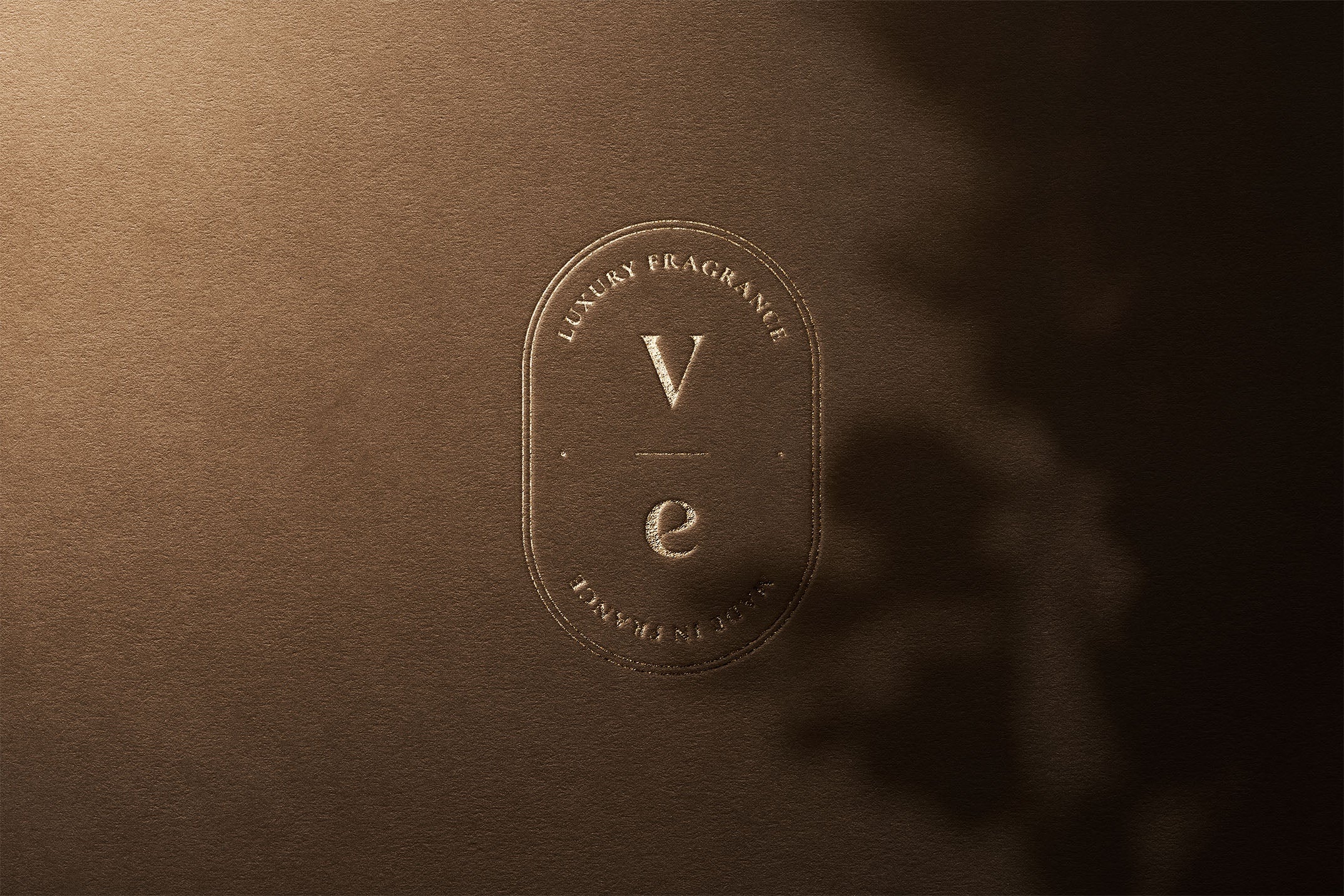
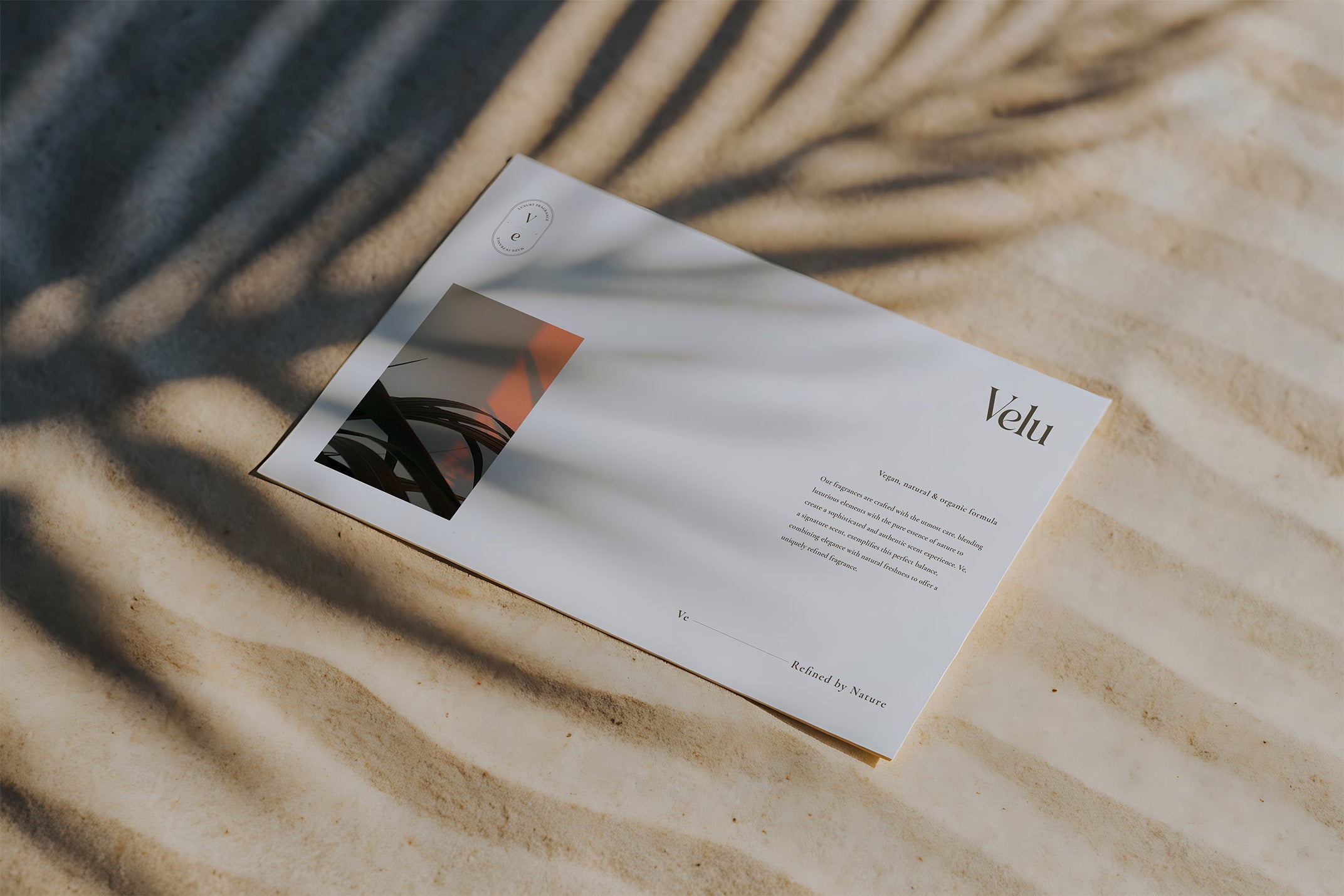
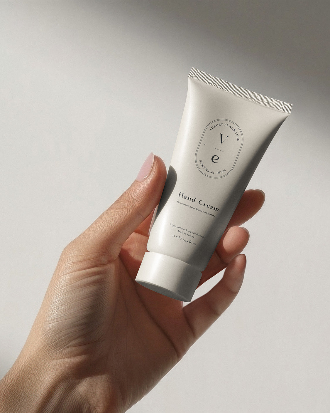
Velu is a Taiwanese fragrance brand offering high-quality, natural products like essential oils, candles, and diffusers. The brand emphasizes uniqueness in its scents through an elegant yet minimalist design. The logo features a refined typeface with subtle serif elements to evoke sophistication, aligning with the essence of fragrance. The "Ve" symbolizes the freshness and natural beauty of emerald and leaves, with fine serifs and soft curves that convey elegance and restraint.
Velu 是一家台灣本土的小型香氛品牌,專注於製作高級感且天然的香氛精油、蠟燭和擴香產品。品牌希望透過優雅而不過於奢華的設計理念,表達每一款香氣的獨特性。在 Logo 設計中,選擇了極簡的字體並融入襯線字體,以傳達出優雅卻不華麗的風格,這與「香氣」的特質相吻合。其中「Ve」字形象徵著「翠」所蘊含的高雅及自然,隱喻著葉子的細緻元素,搭配纖細的襯線與柔和的曲線,營造出一種高雅與內斂的印象。

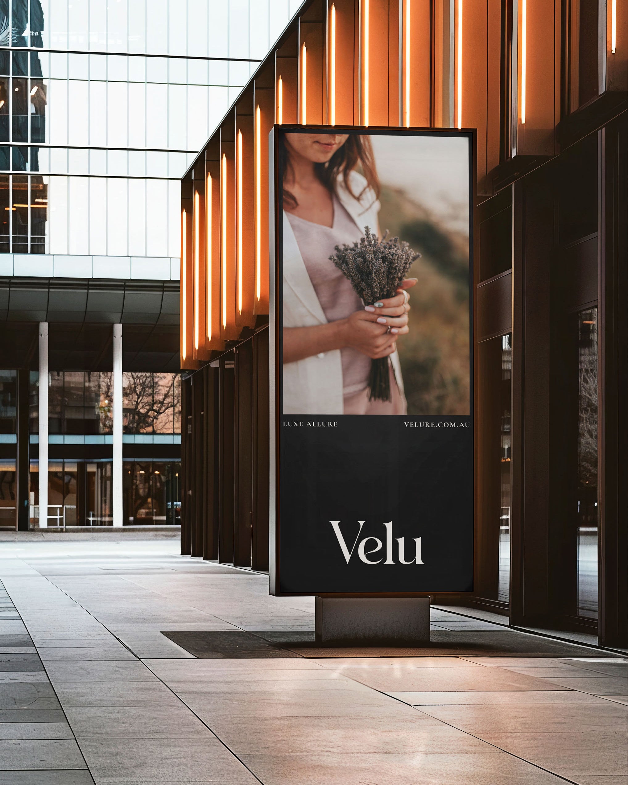
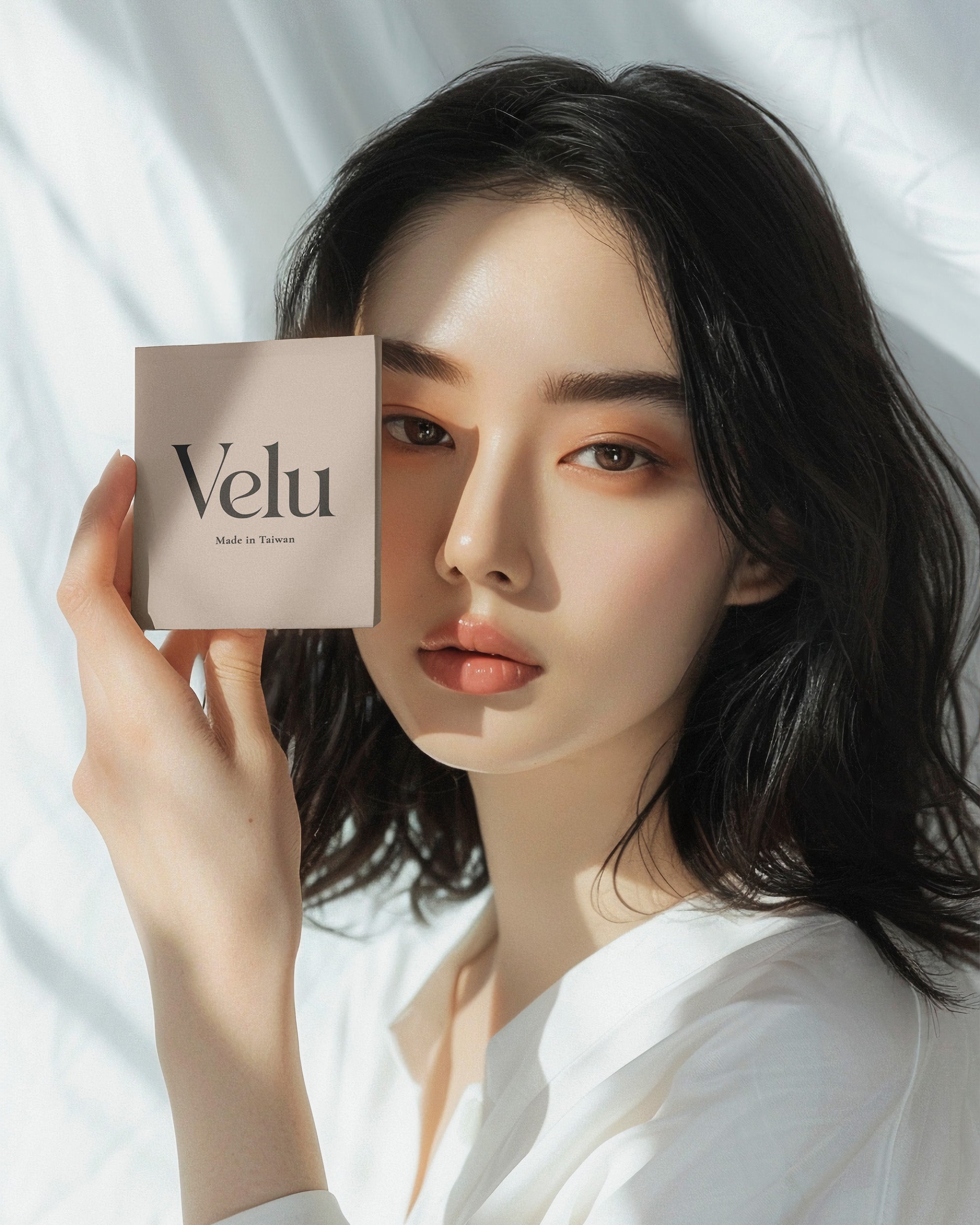
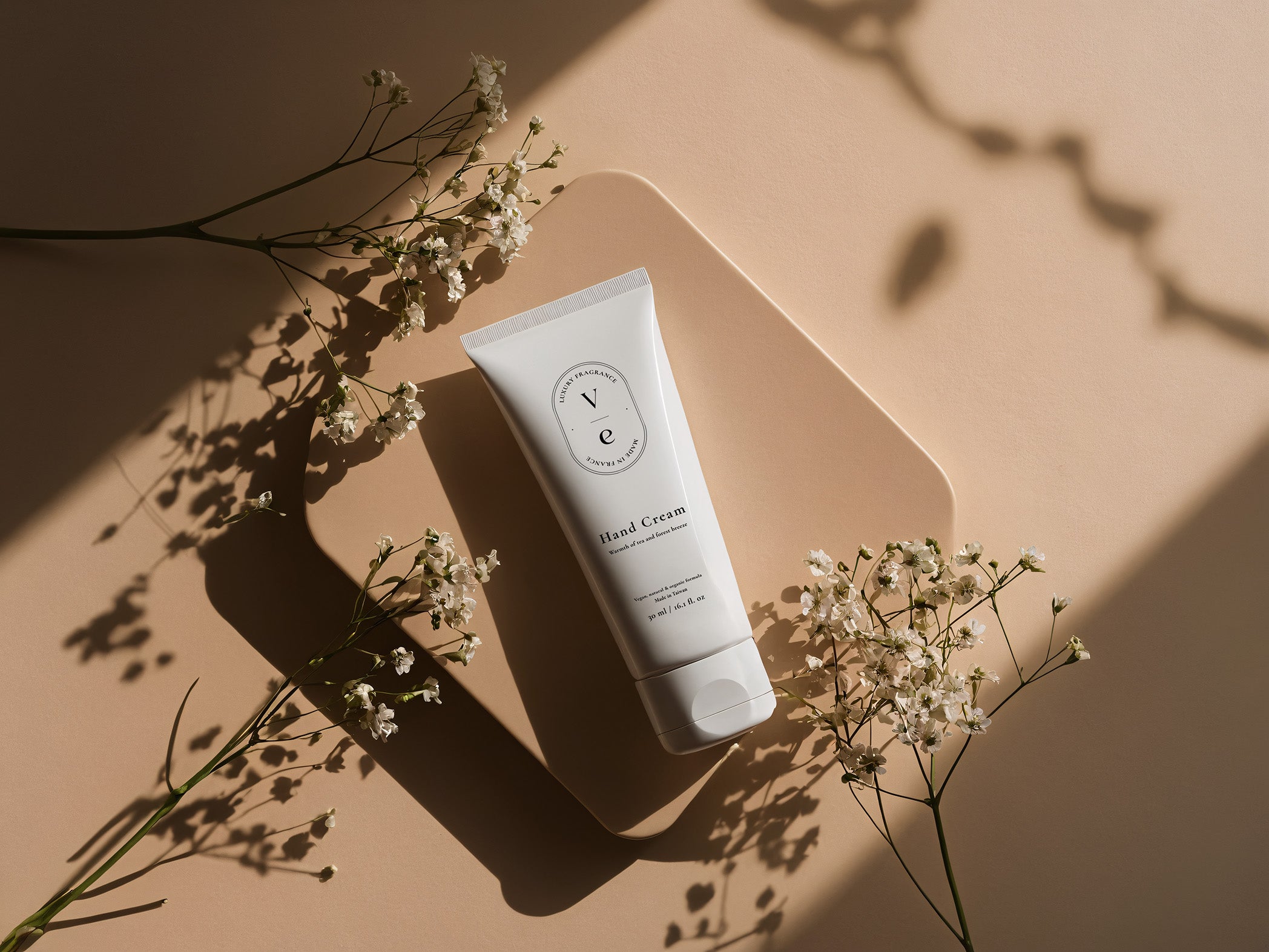
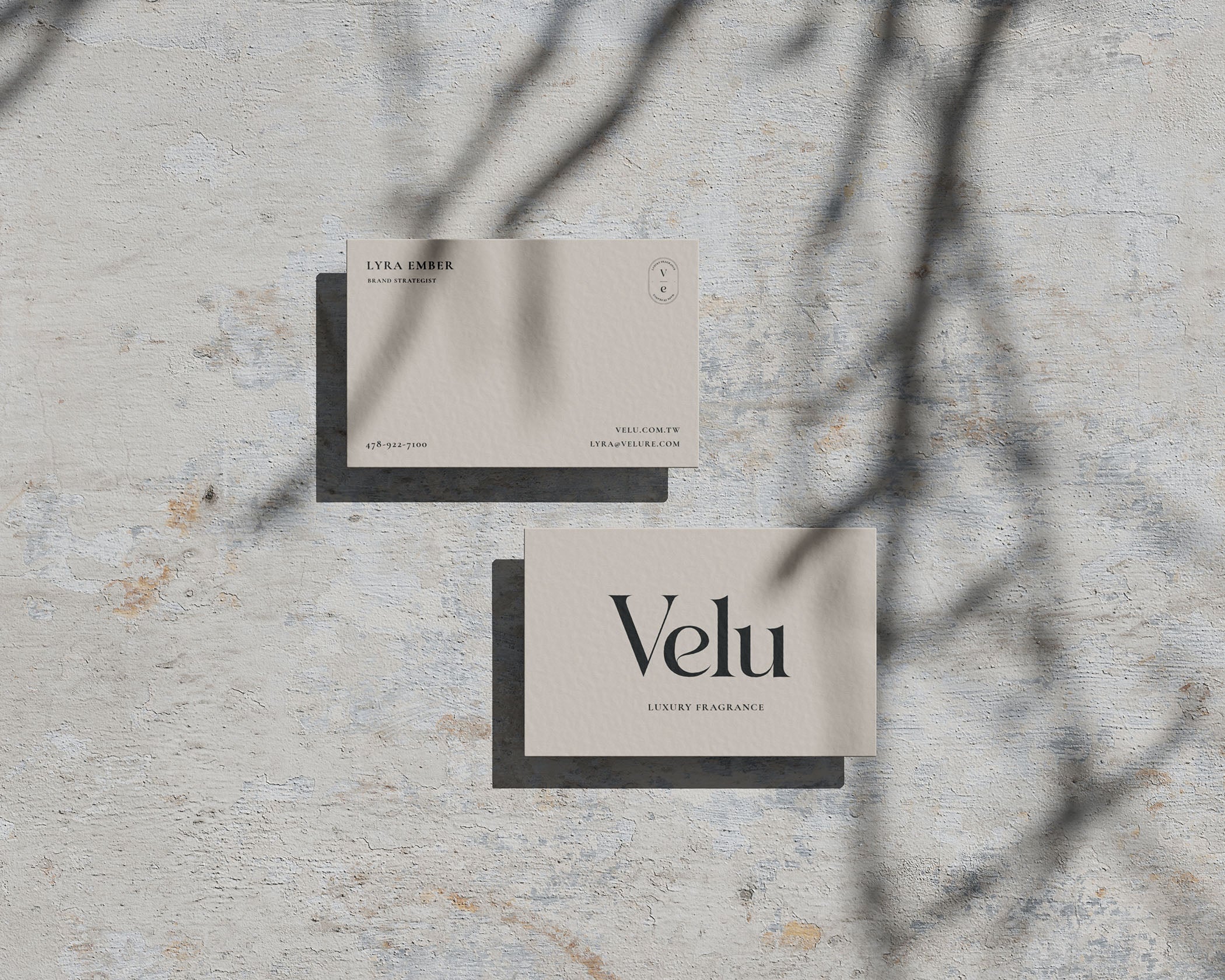
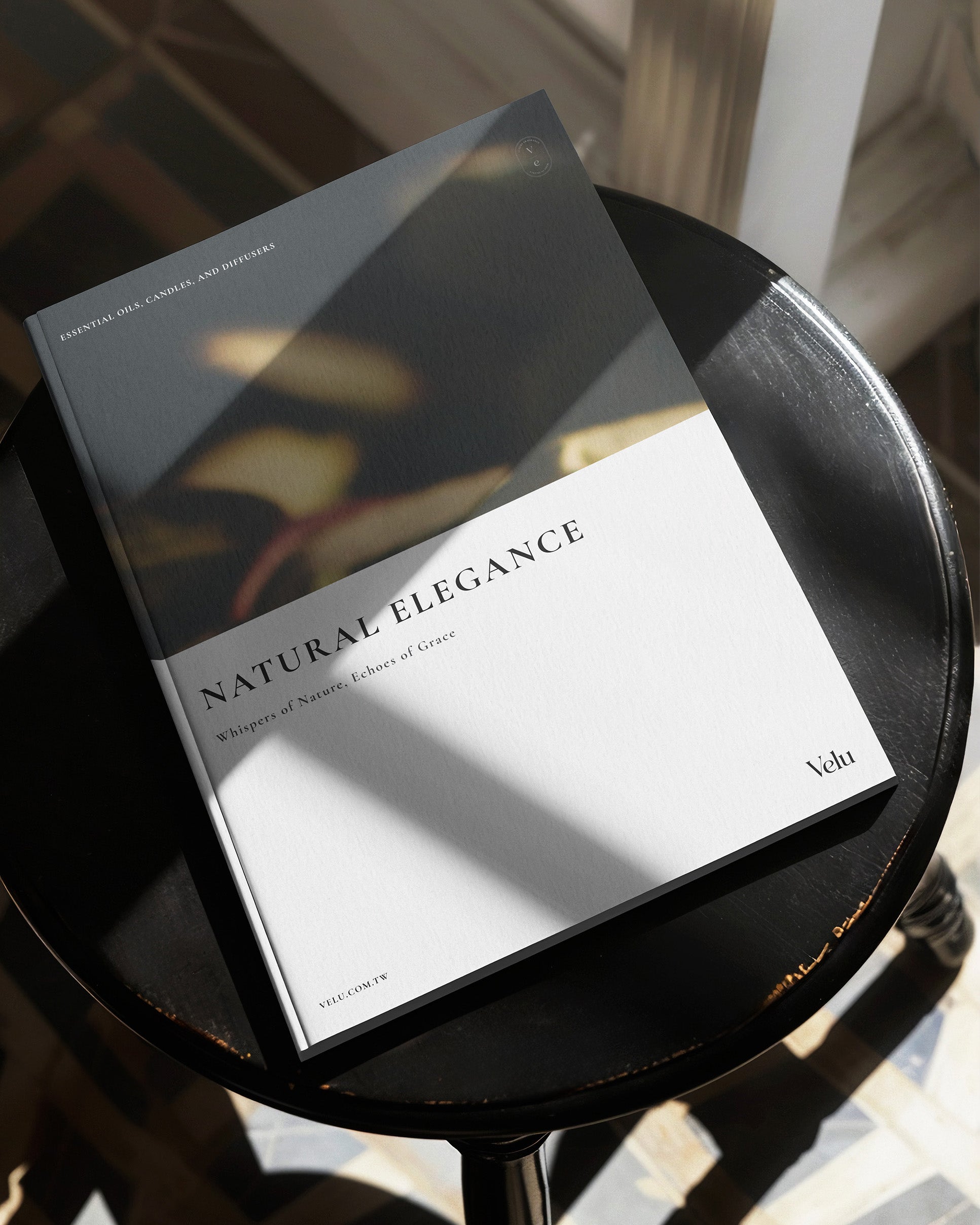

As a local Taiwanese fragrance brand, Velu combines the concepts of "emerald" and "dew," symbolizing the first drop of morning dew that reflects the flow and transformation of natural energy. This energy helps individuals find balance and vitality from body to spirit in the early hours of the day.
來自台灣的 Velu 香氛品牌,以「翠」與「露」的結合為命名,象徵清晨的第一滴露水,展現自然能量的流動與轉化,讓人在清晨找到身心的平衡與活力。
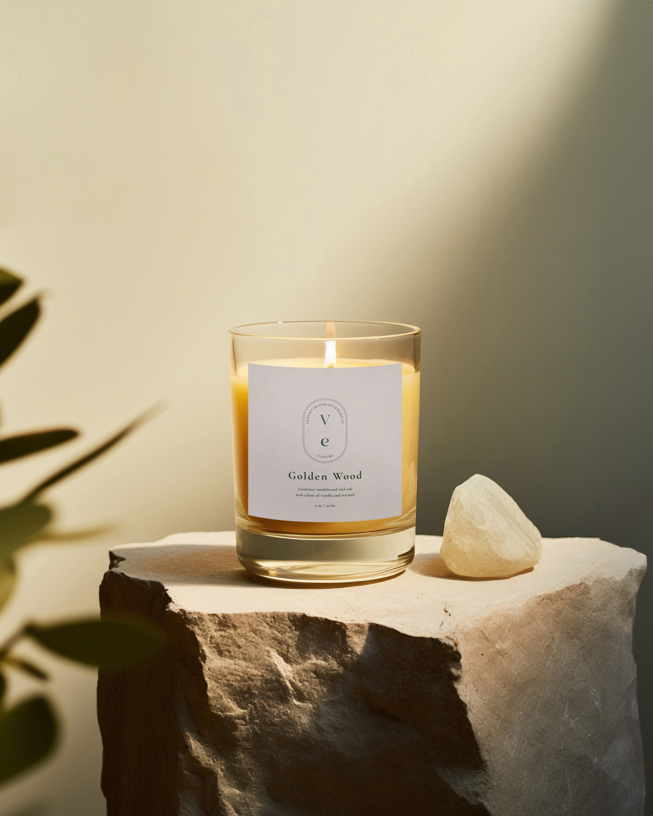

This project utilizes a minimalist style infused with sensory experiences to showcase a serene atmosphere of self-reflection. The visuals are immersed in a refreshing and vibrant ambiance, evoking a sense of renewal and tranquility.
該專案以極簡風格結合感官體驗的視覺,旨在展現如靜謐空間中的自我沉澱,營造出高級氛圍,讓視覺更加沉浸於清新透亮且充滿活力的感受之中。
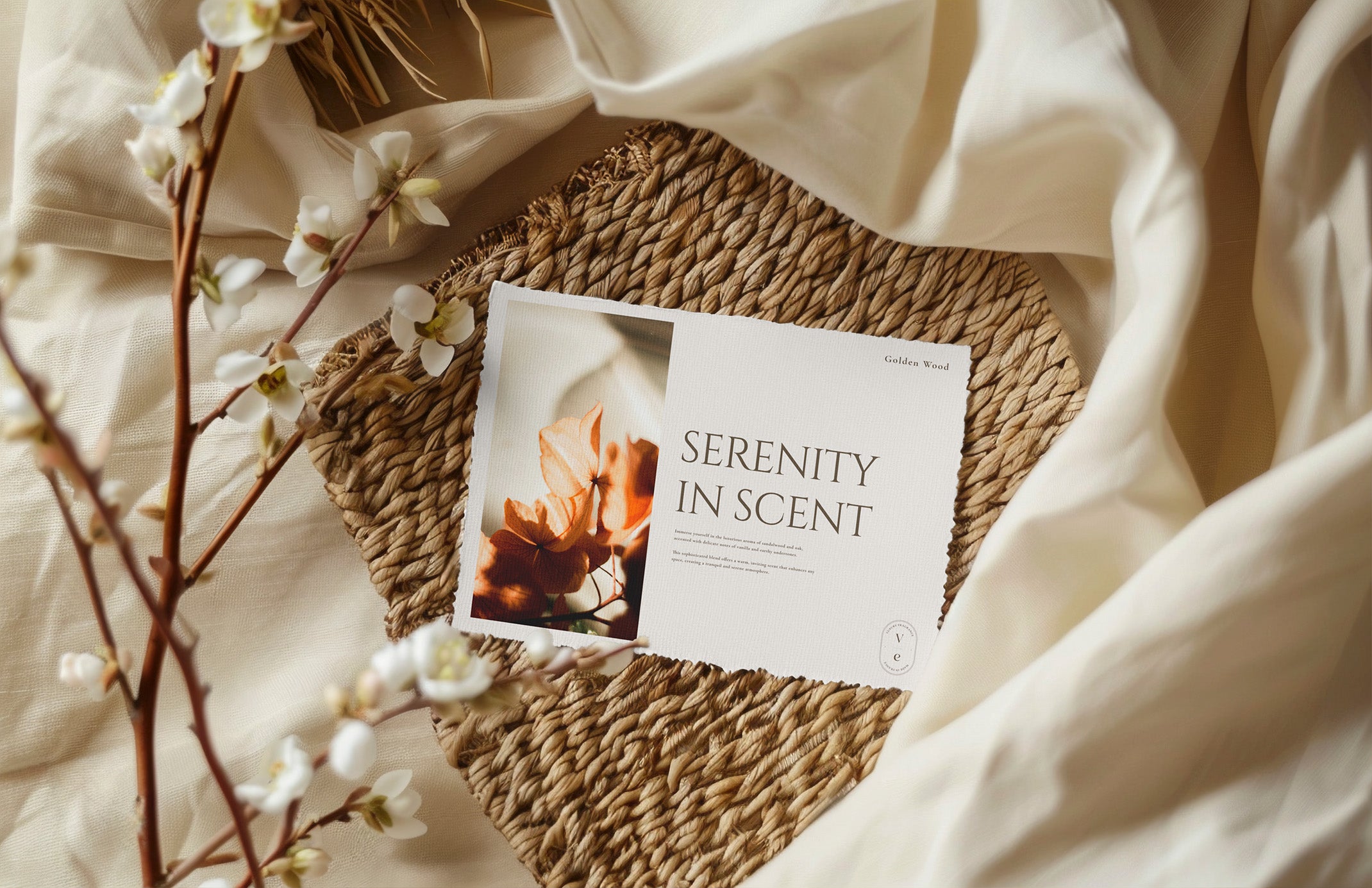
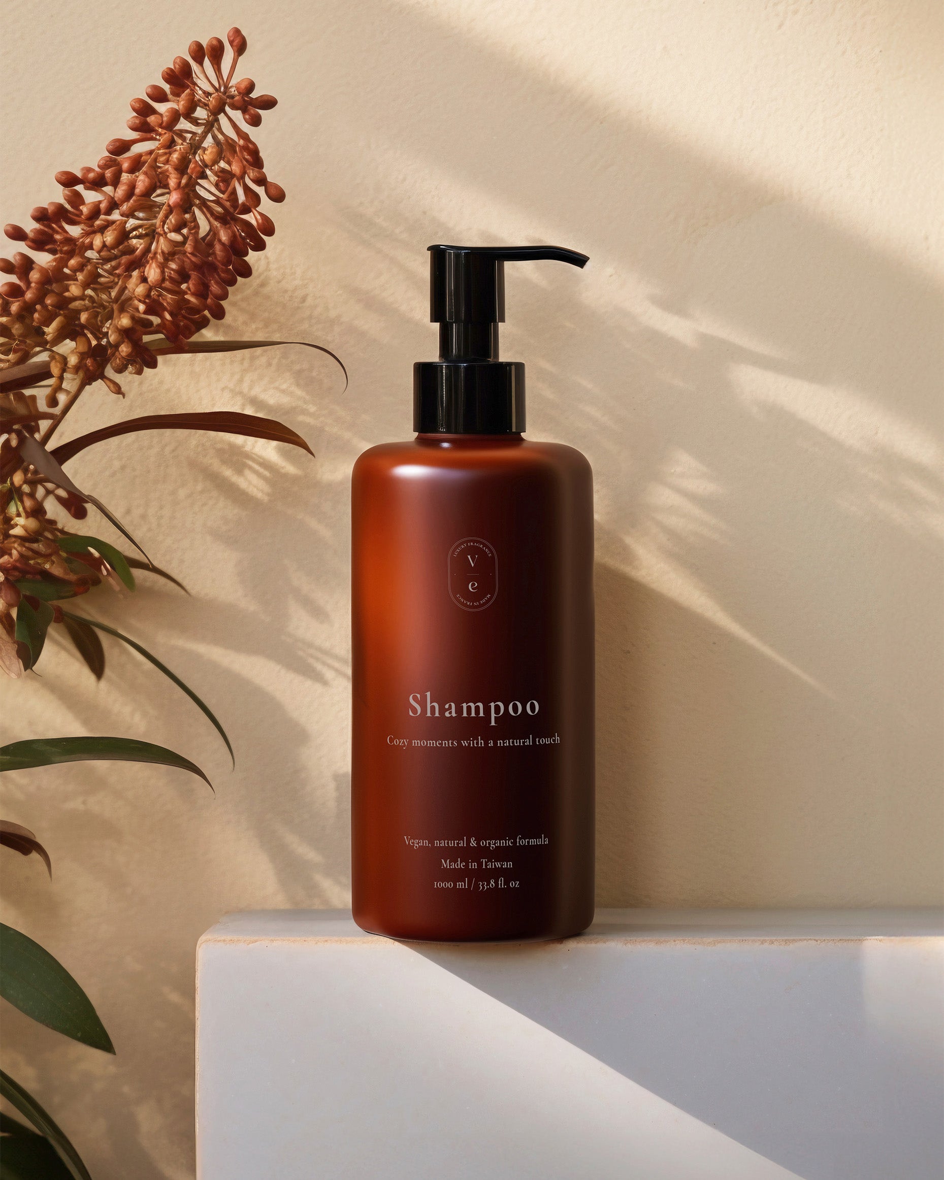
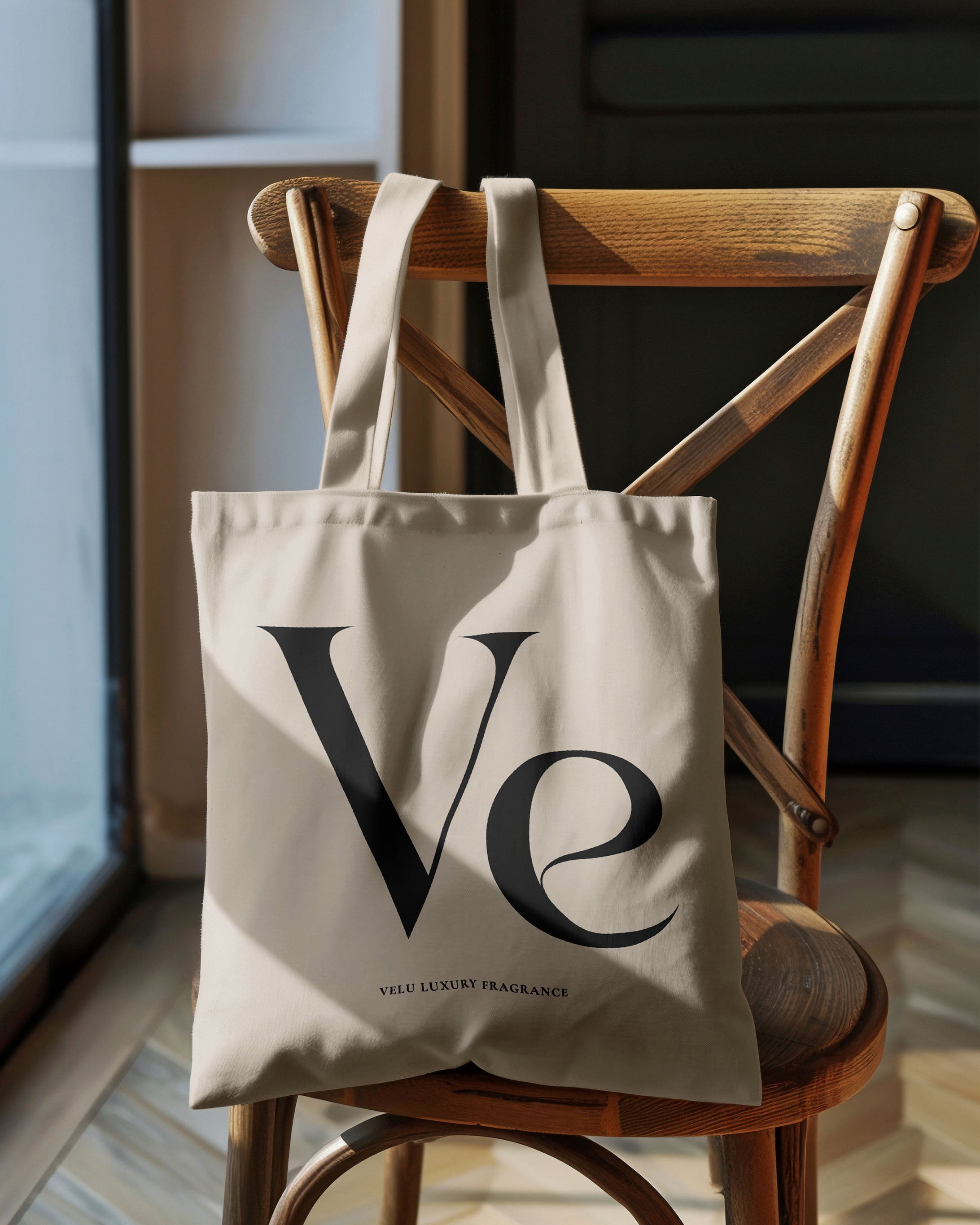
Velu's design exudes understated elegance, blending simplicity with subtle luxury. The core elements are intentionally minimal to highlight a noble identity, while the typography is stable and refined. "Ve" and "Lu" embody clarity and grace, evoking a sense of sophistication that resonates with an audience seeking refined fragrances. This approach creates a quiet yet unmistakable impression of luxury.
為了呈現不過於華麗但卻充滿氣質的形象,設計上融合了簡約的寧靜與美感。Velu 的核心元素以低調的方式展現,意在顯示其高貴與優雅的身份。視覺文字編排穩重且簡約,字母的組合則創造出一種長久的基礎設計,其流暢的線條重心來源於清晰而非強勢的表現。「Ve」與「Lu」的理念更能迎合觀眾對高雅香氣的渴望,這些視覺元素交融在一起,形成出人意料且無可否認的內斂華麗印象。
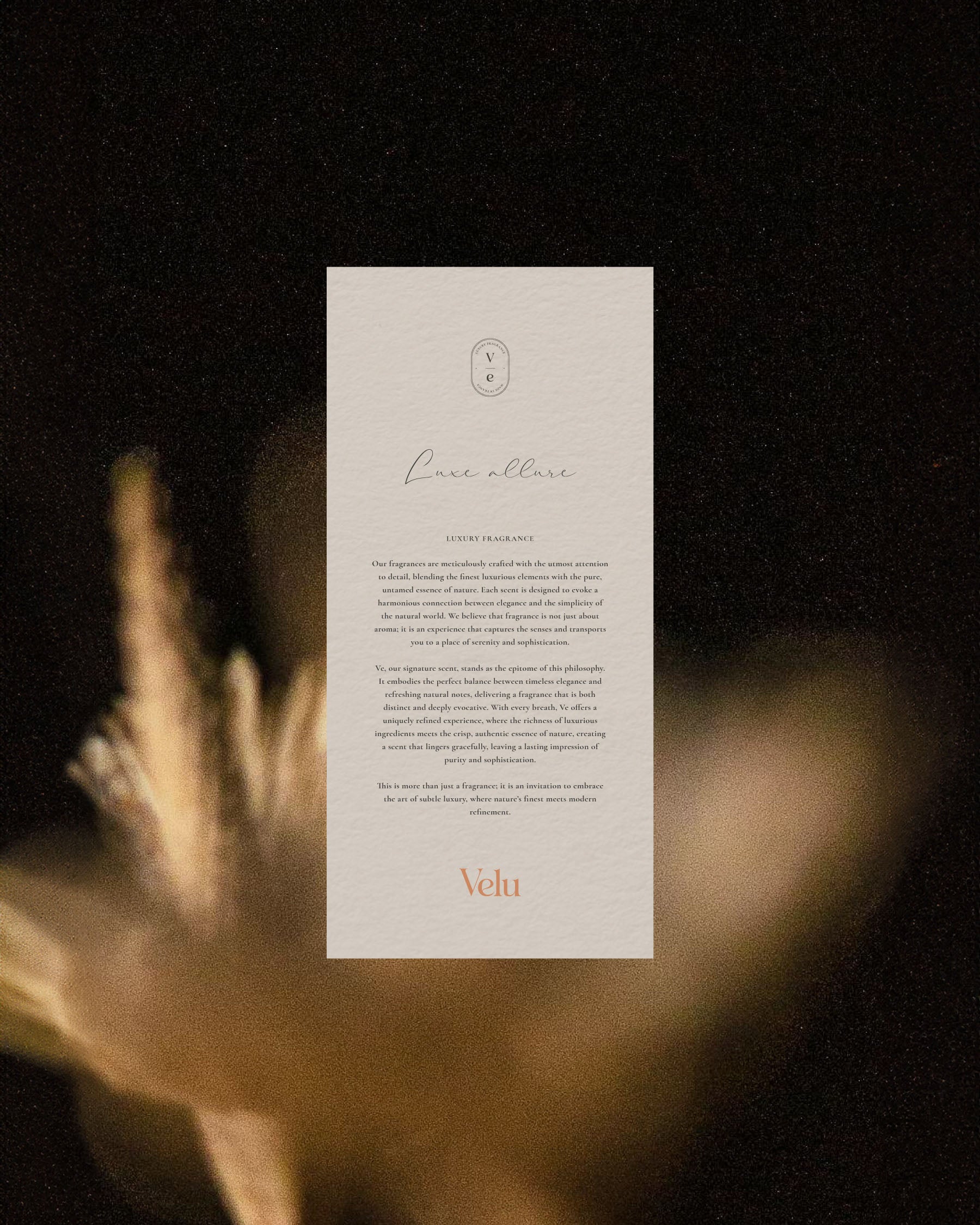
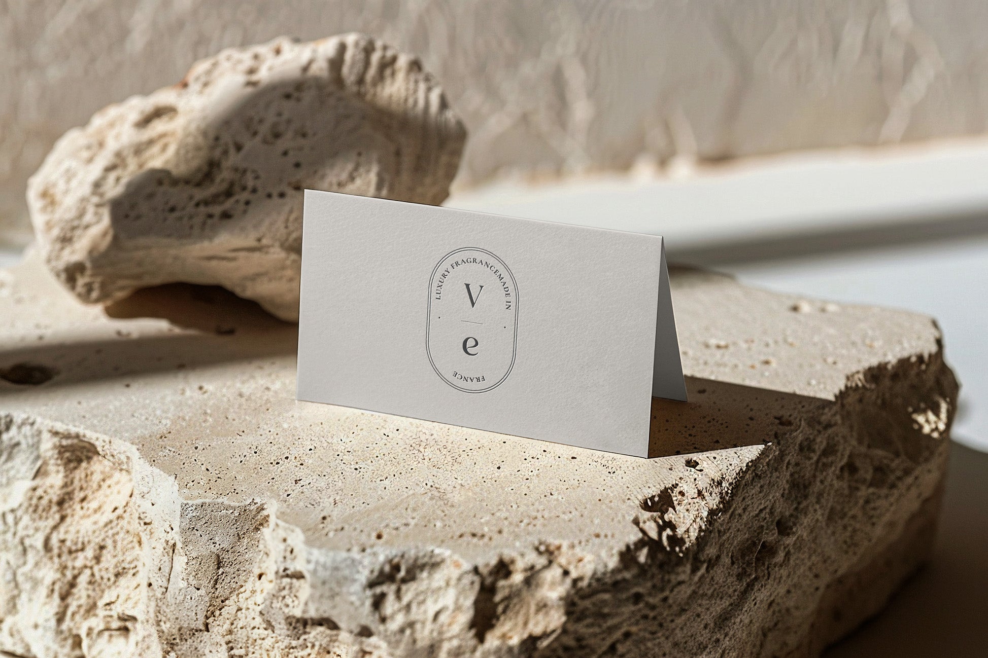
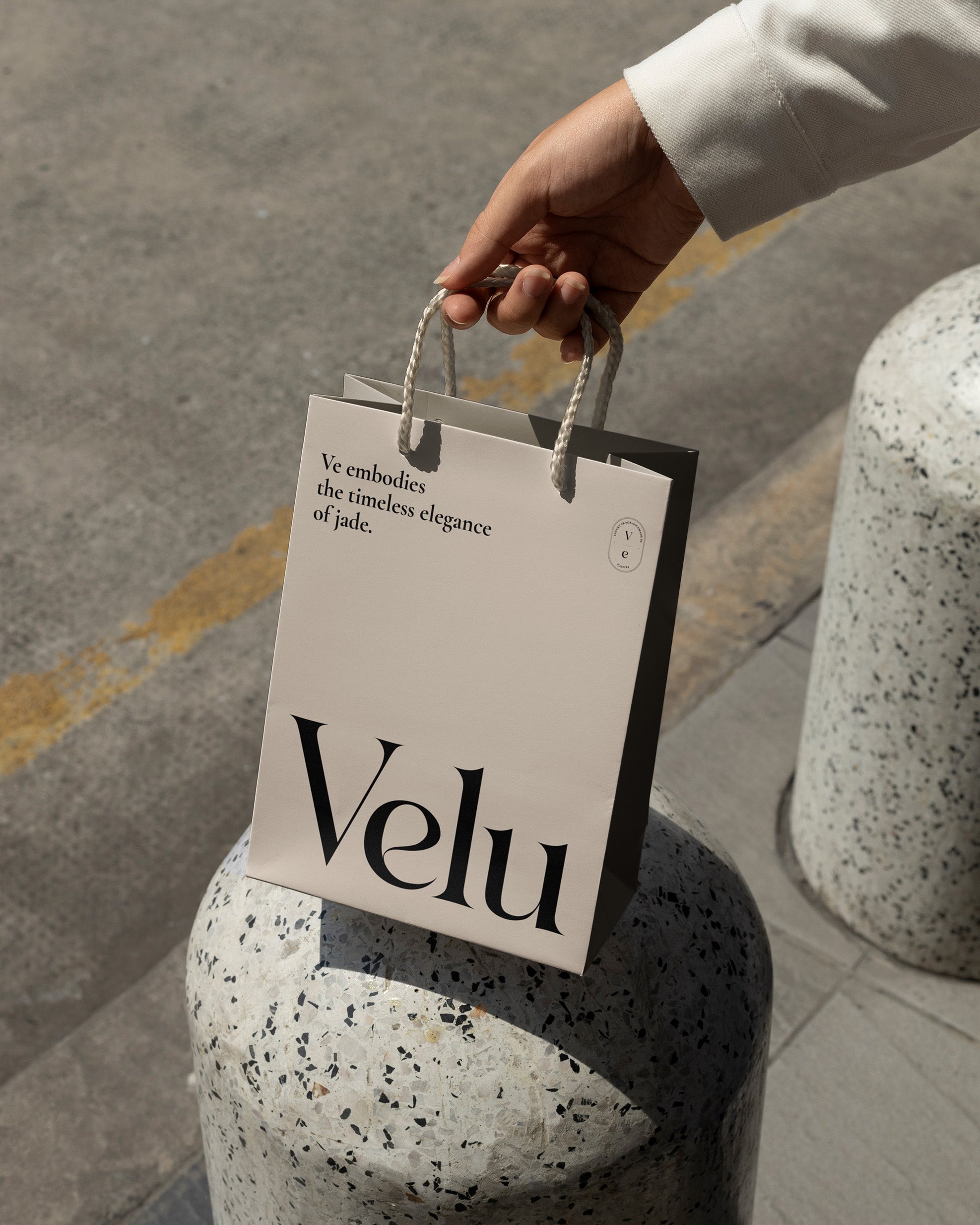
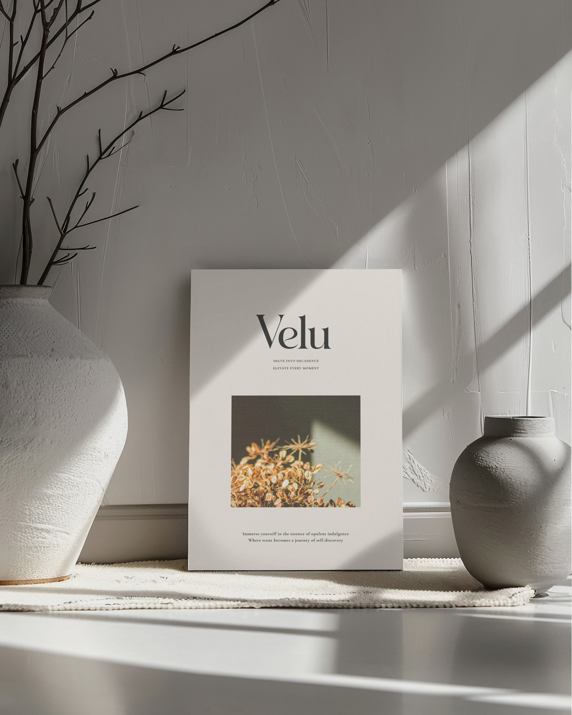
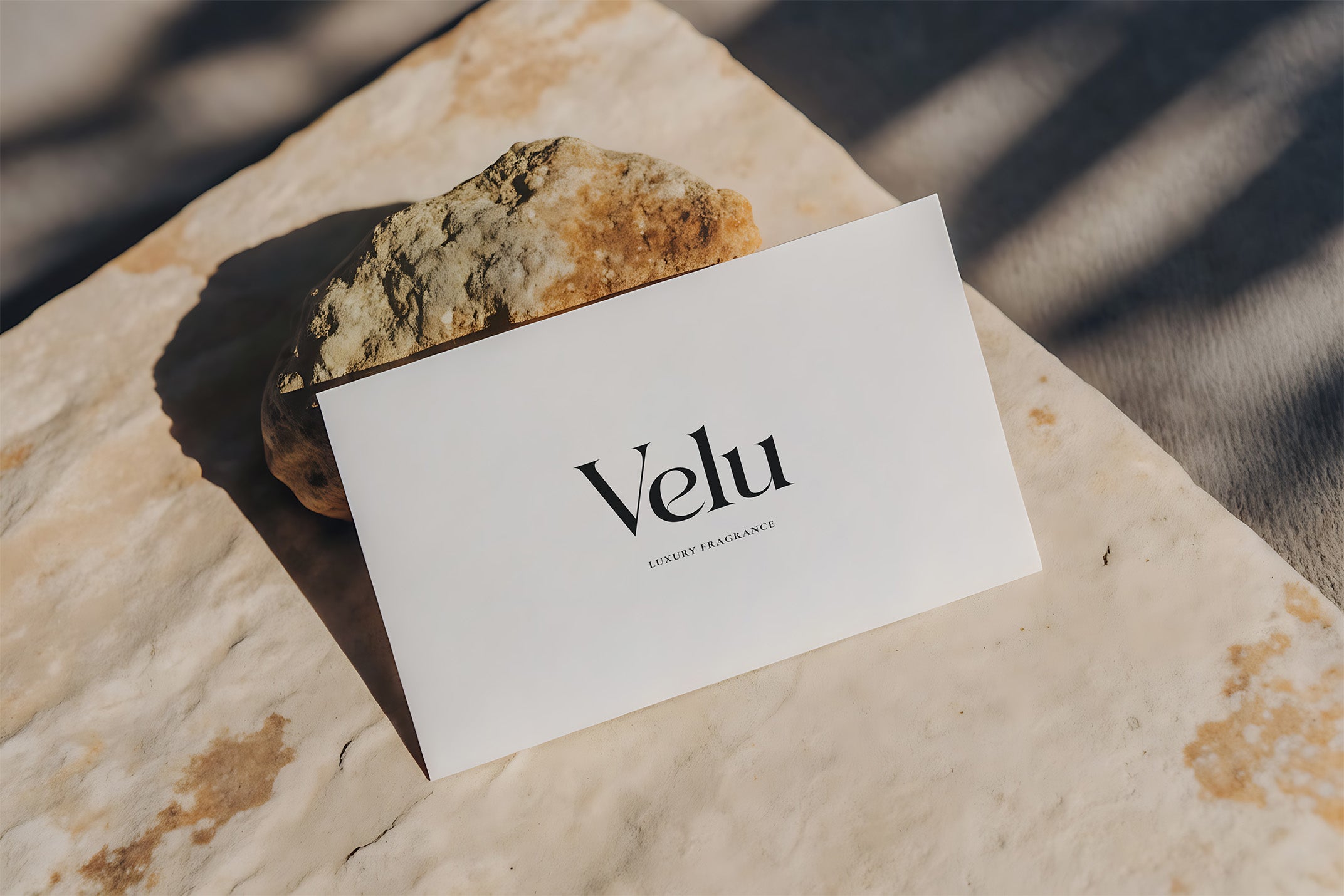
This brand visual centers around the logo, showcasing the elegance through subtle variations in stroke thickness without altering original elements, thereby adding depth to the text. To enhance the brand's sophisticated image, serif typefaces are precisely employed in every detail, creating a strong impression for customers. The minimalist logo can boldly adapt to various styles of advertising, cleverly connecting with different domains and enhancing Velu's overall identity.
這一品牌視覺的核心為 Logo,以細微的筆畫粗細變化來表現品牌的高雅,而不改變原有元素,進一步增強文字的深度。為了讓風格充滿氣質和高級感,在每一個細節上精確地使用了襯線字體,以提升顧客的印象。這個極簡之美的 logo 大膽運用於各類廣告上,不僅對各個領域的風格和細節進行巧妙的呼應,還能提升 Velu 的整體形象。
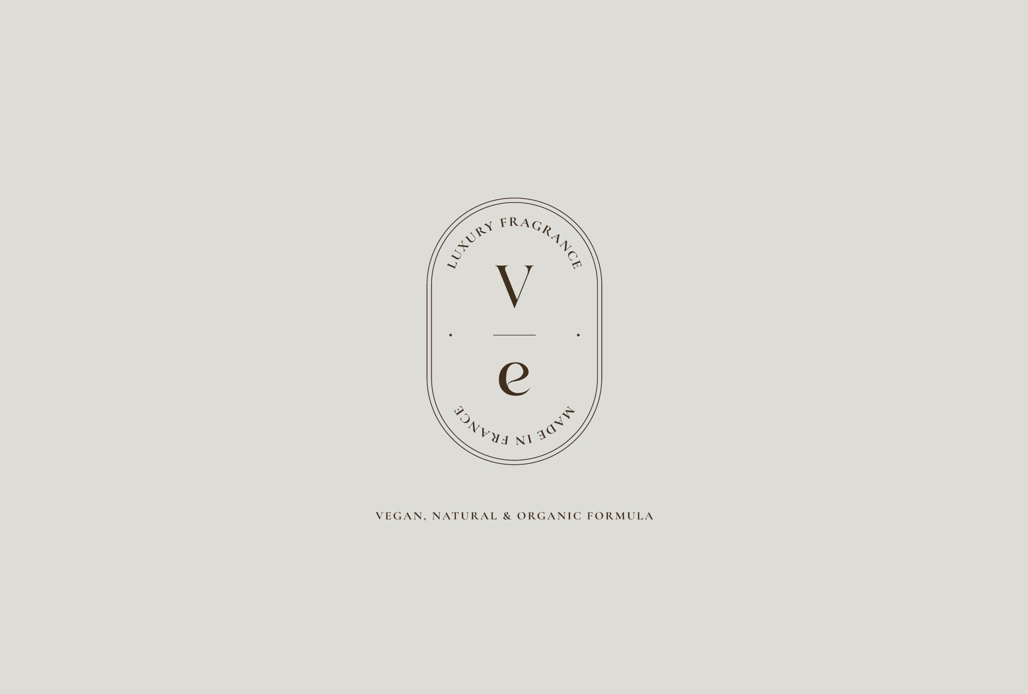
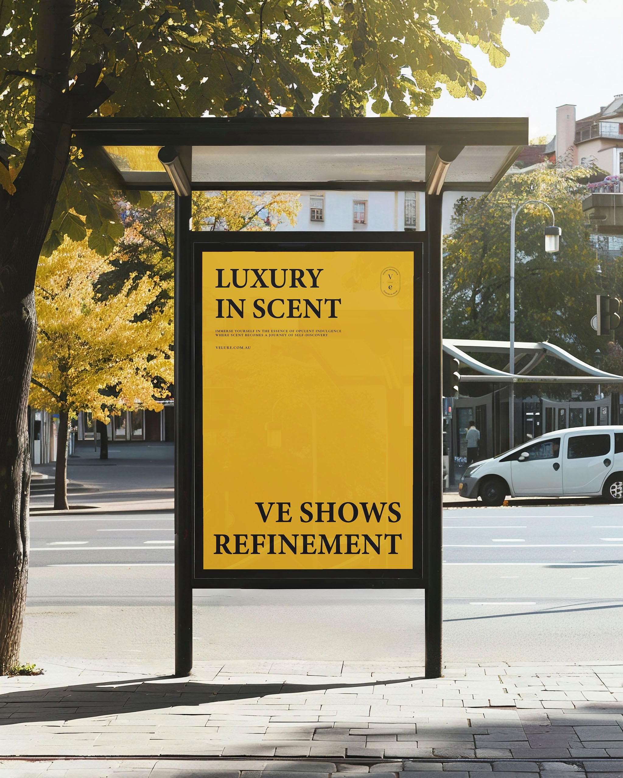
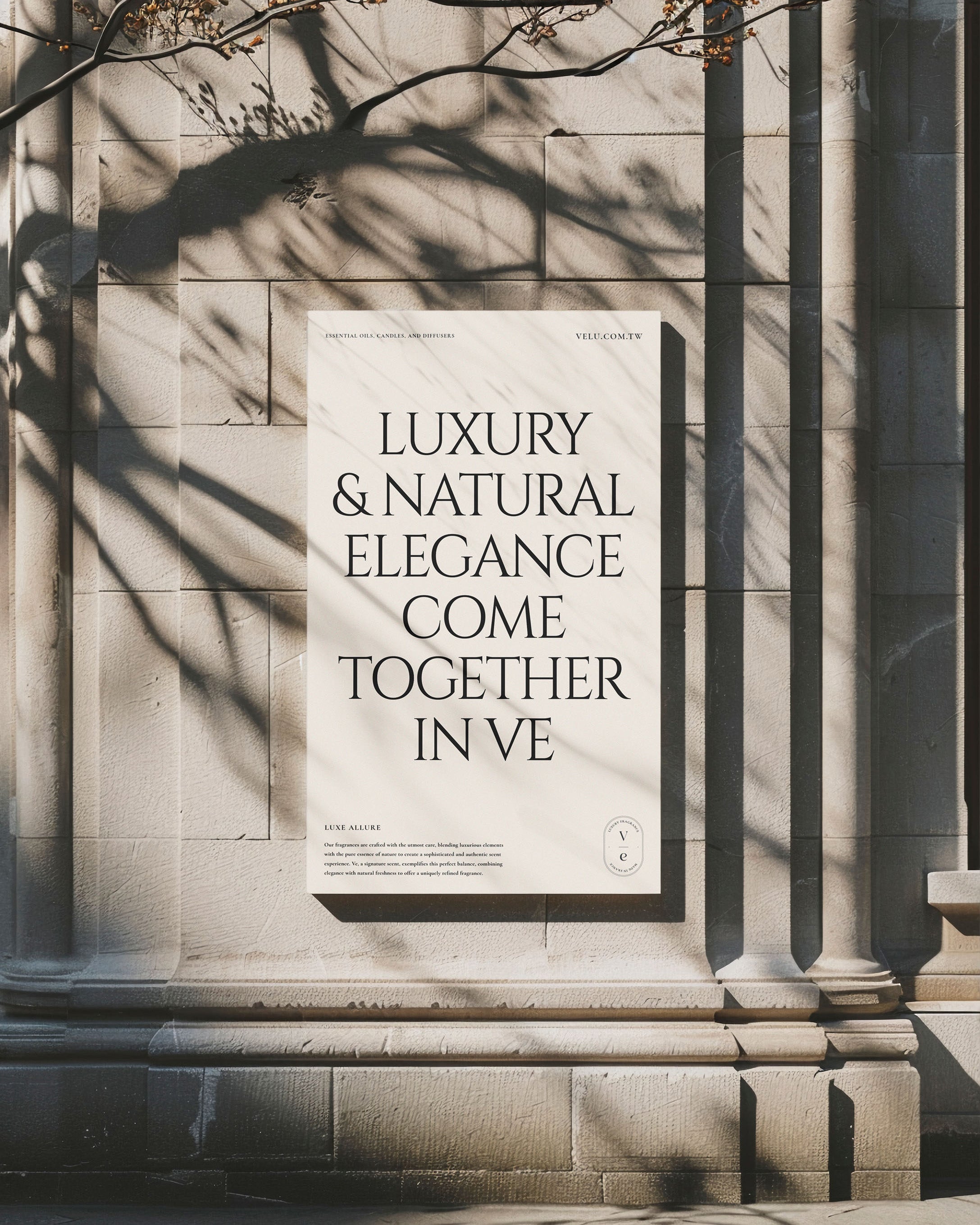
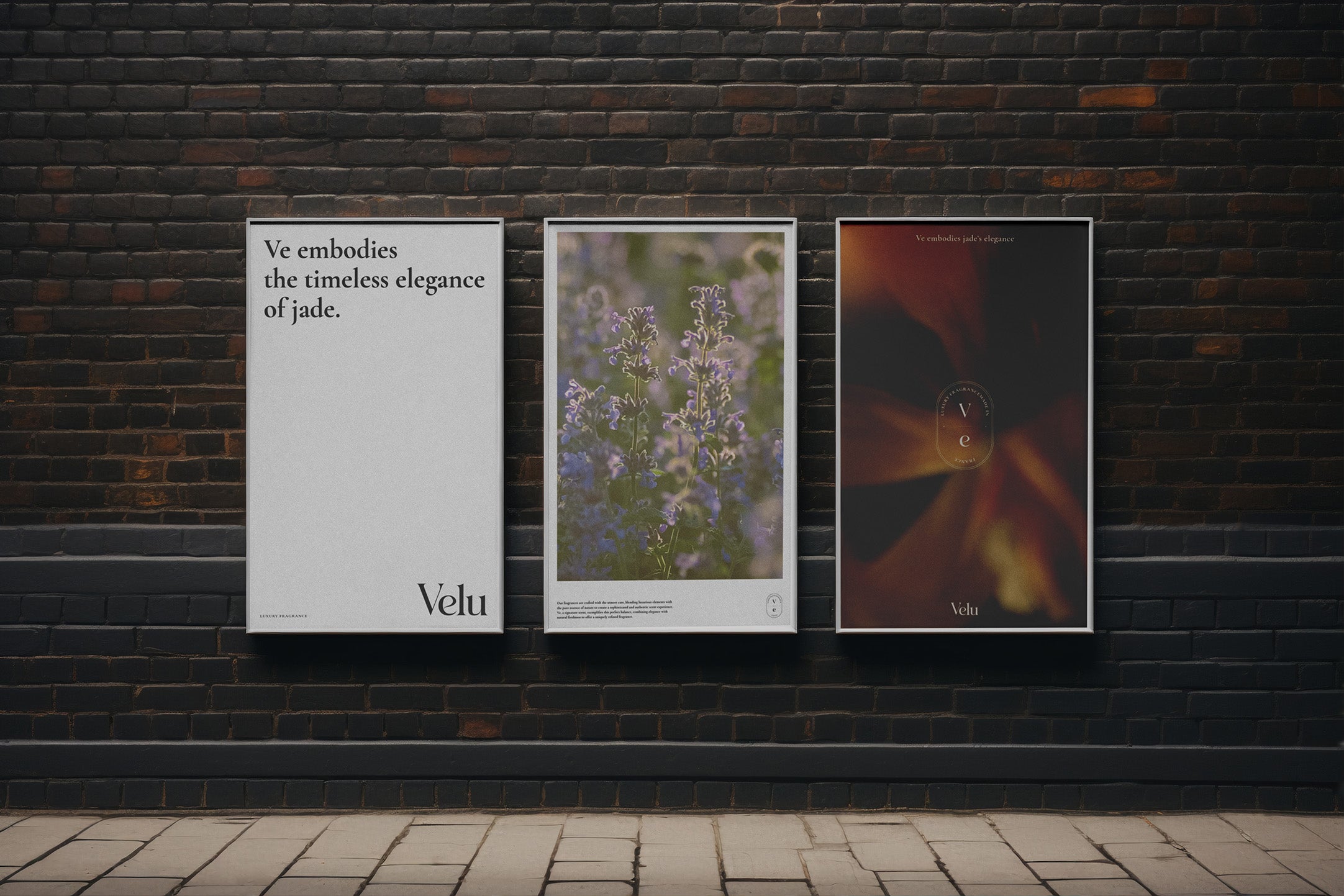
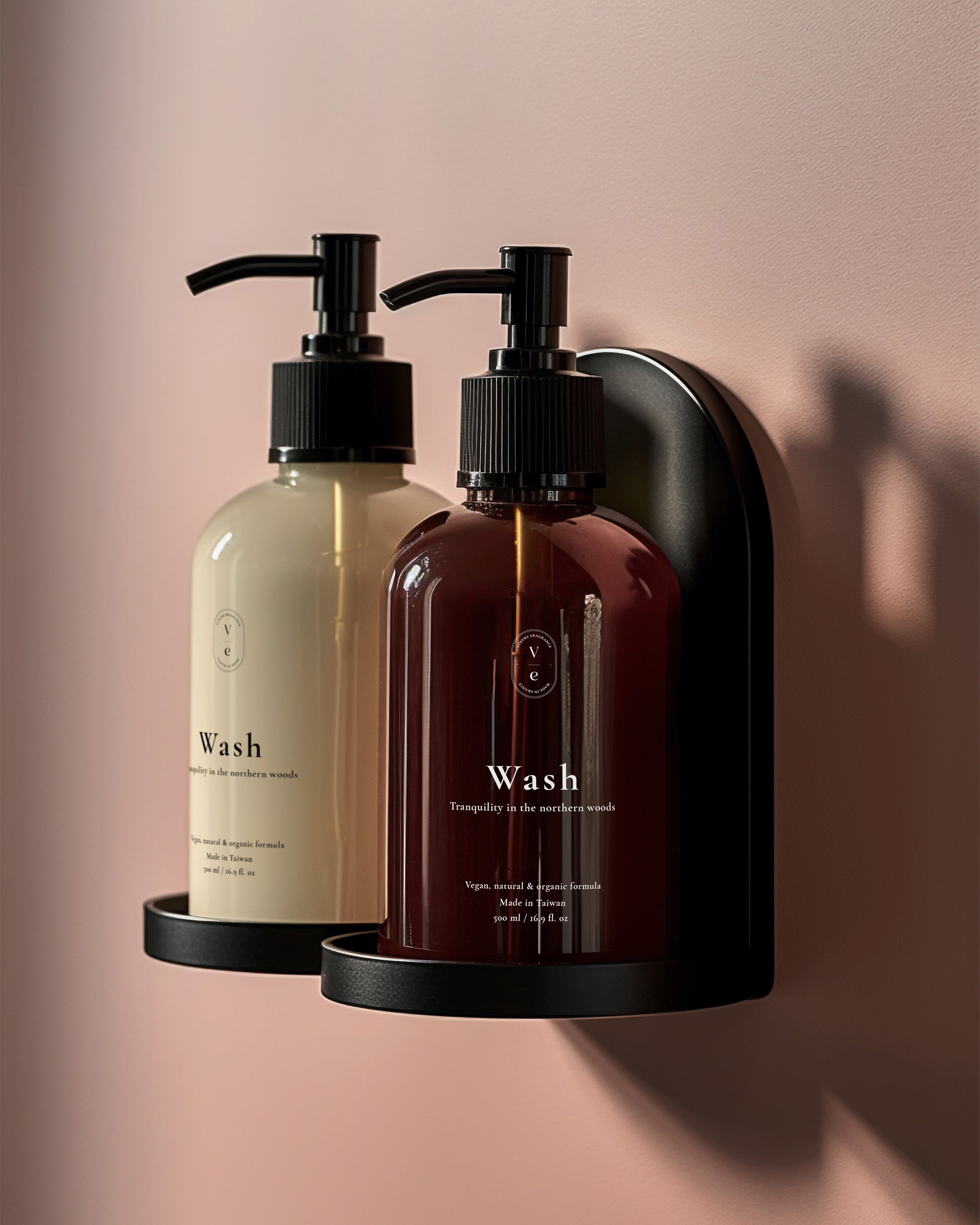
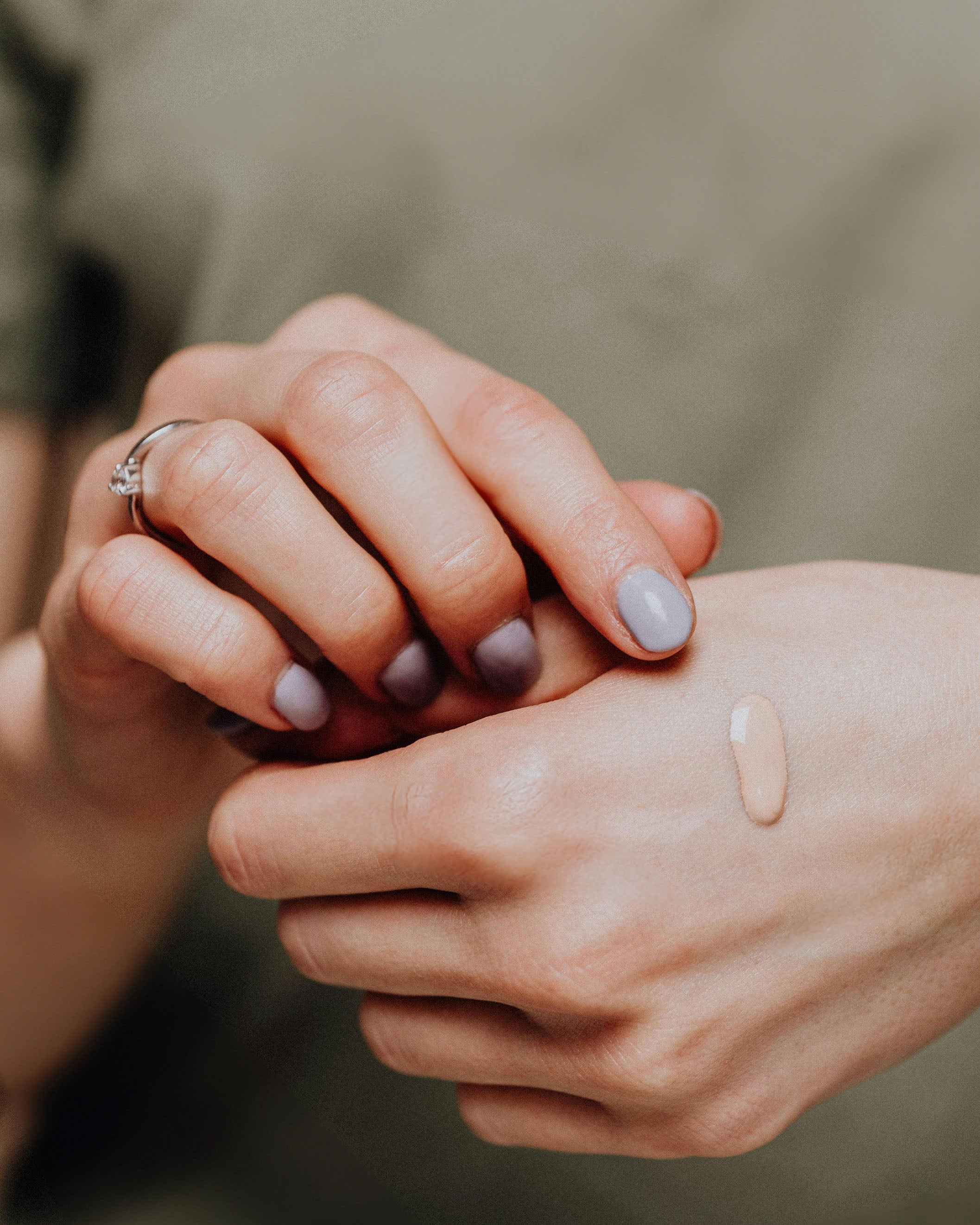
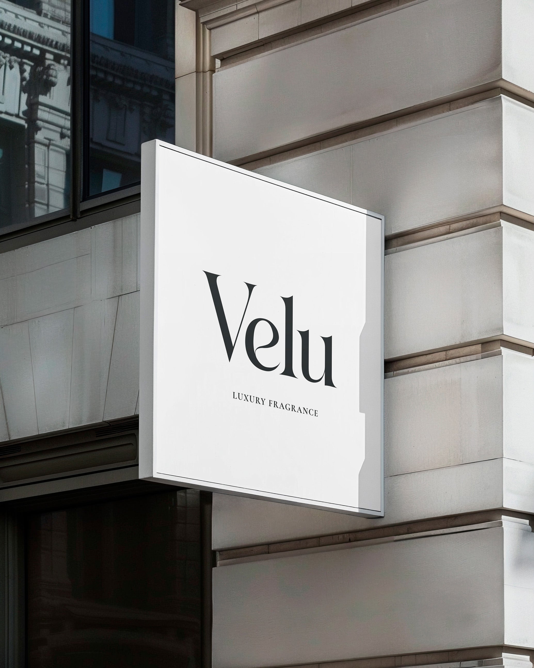
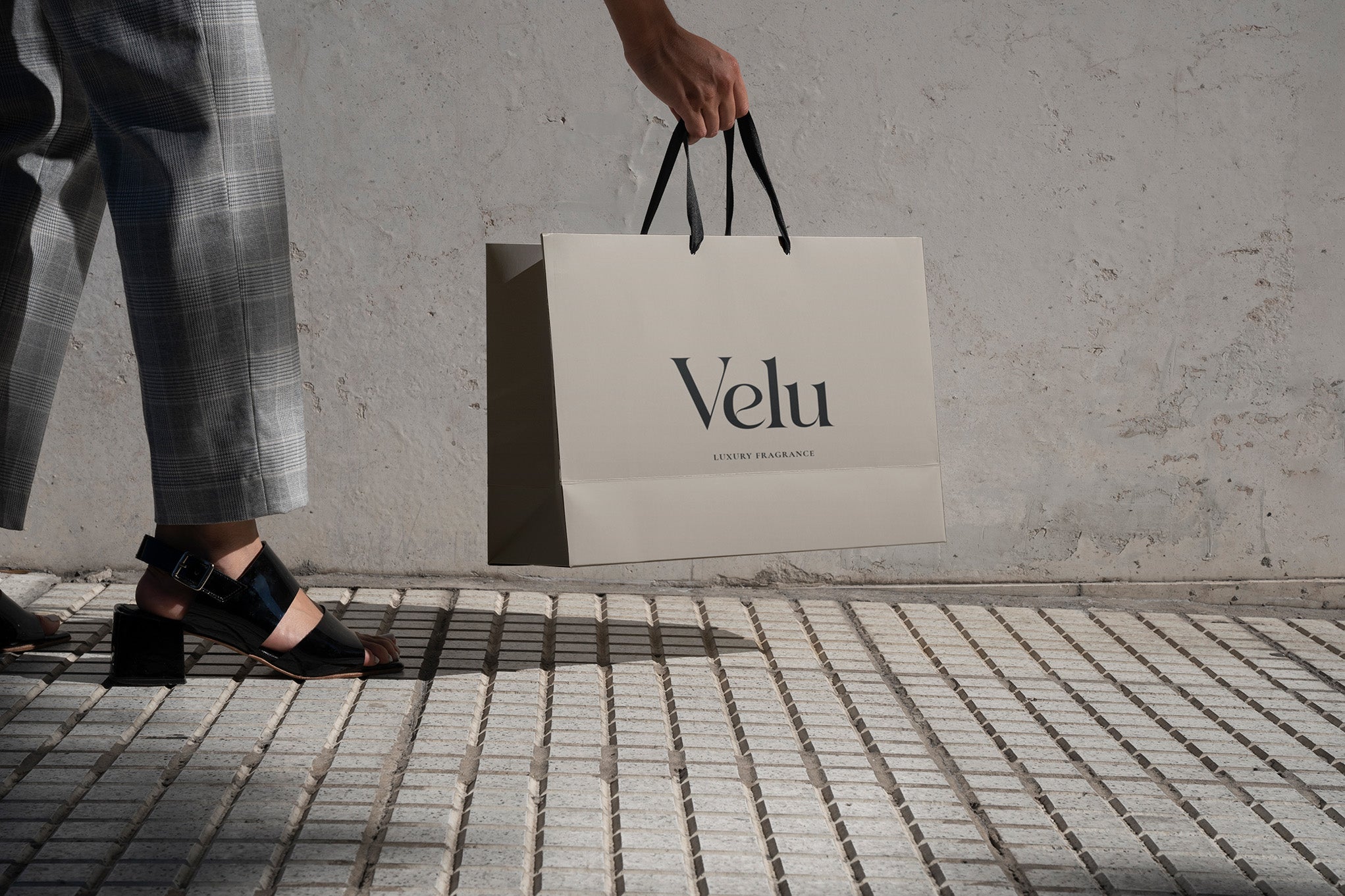
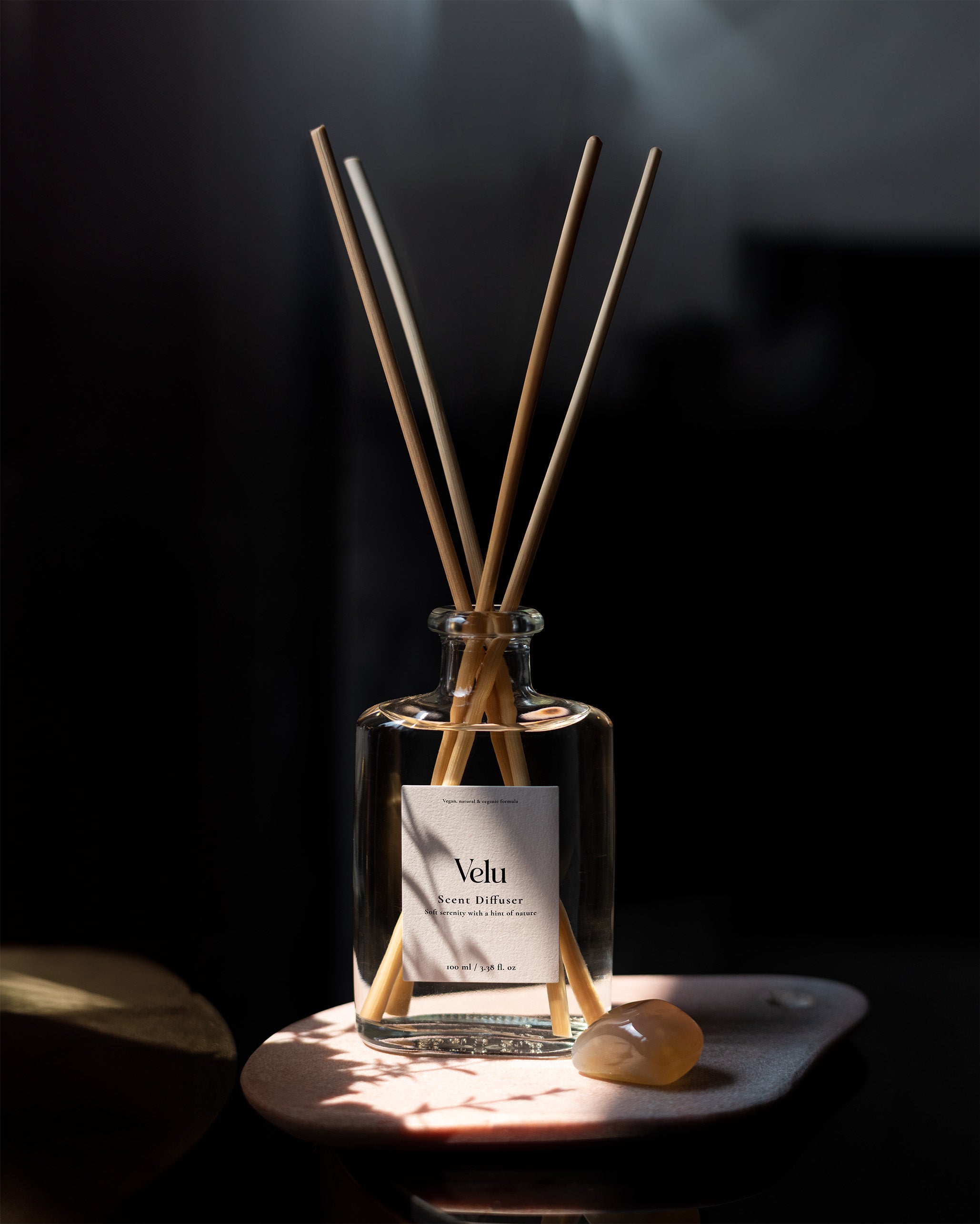
Velu's plant-inspired imagery embodies elegance and balance, with a flowing serif typeface and well-spaced letters that evoke freshness, nature, and serenity. The design highlights themes of purification, healing, and dreamlike relaxation, reflecting the brand's commitment to comfort for the body, mind, and spirit. Velu aims to offer consumers a serene, dreamlike experience with every product.
受到植物靈感啟發的形象,使品牌的平衡更為精妙,充滿象徵性的高雅意義。整體概念的核心是優雅流暢的襯線字體設計,字母之間的完美間隔展現了整體的精緻感。這些元素不僅傳達了清新和自然的感受,還融入了淨化、療癒和夢境的意象,強調了品牌在提供身心靈舒適與寧靜方面的承諾。透過這樣的設計,Velu 希望讓消費者在每次使用產品時,都能感受到如夢境般的愉悅與放鬆。
Join us on a brand adventure: strategy, positioning, visuals, and graphics. We're your partners in shaping a cohesive brand narrative.
美,浮現;由木而生

浮木藝術創作工作室
DESIGNING -
NOT JUST WORKING
To speak to us about a new project, please email fuumustudio@gmail.com
