Yong Pu Bakery is a traditional bakery located in Taichung, known for its unique blend of traditional Chinese and Western-style breads, cookies, and pastries. The client desires a brand image that breaks away from the typical traditional bakery, avoiding the use of standard Chinese fonts. Instead, they prefer rounded and sans-serif fonts, combined with elements of bread, evoking a feeling of deliciousness at the sight of the brand’s name.
永璞麵包店位於台中,是一家融合中西烘焙精髓的老字號麵包店,主要販售傳統中式麵包、餅乾及點心。客戶希望品牌形象能夠突破傳統,避免使用傳統的中式字體,轉而採用圓體與無襯線字體,並融入麵包元素,讓消費者看見品牌名稱時,能立刻聯想到美味的麵包。
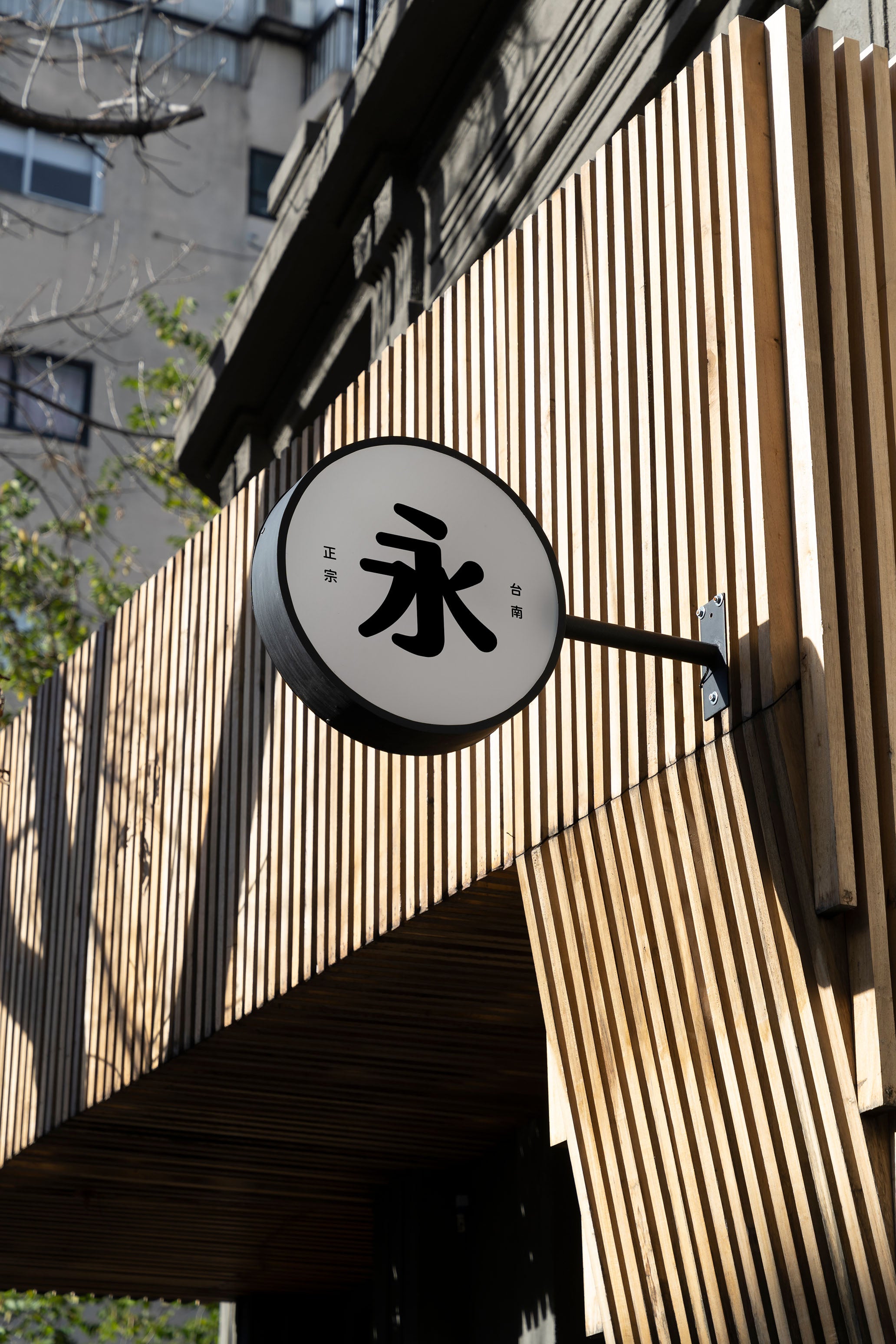
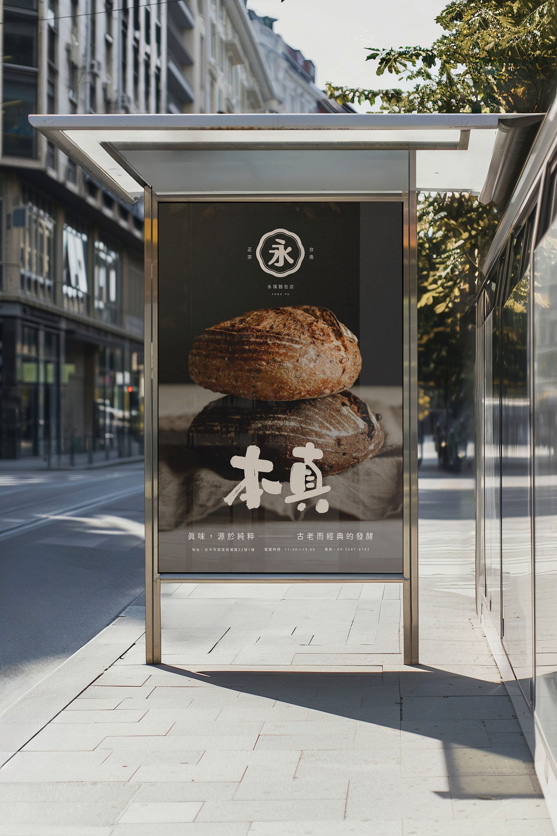
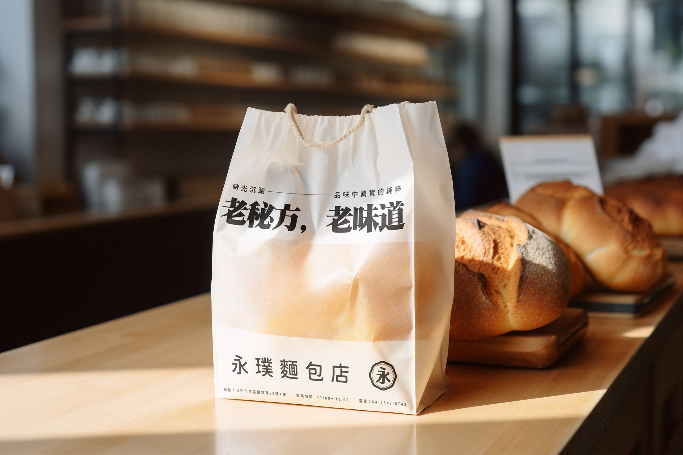
Over the past 60 years, Yong Pu Bakery has become a local icon, renowned for its unique blend of traditional and Western-style breads, all made without any additives, maintaining a natural and original taste. As a well-loved and established bakery, they approached us to refresh their brand image. We were captivated by the deliciousness of their products and, through an appreciation of their baking philosophy, we aimed to build a more attractive brand image rooted in their traditional culture.
永璞麵包店以其獨特的經典風味在過去60年裡成為當地的知名品牌,專注於傳統與西式麵包的結合,並堅持不添加任何添加劑,保持自然、原味的品質。作為一家受人喜愛的老字號麵包店,他們希望能夠刷新品牌形象。我們深受其產品的美味吸引,透過了解其背後的烘焙堅持,我們得以在尊重傳統文化的基礎上,為其打造更具吸引力的品牌形象。
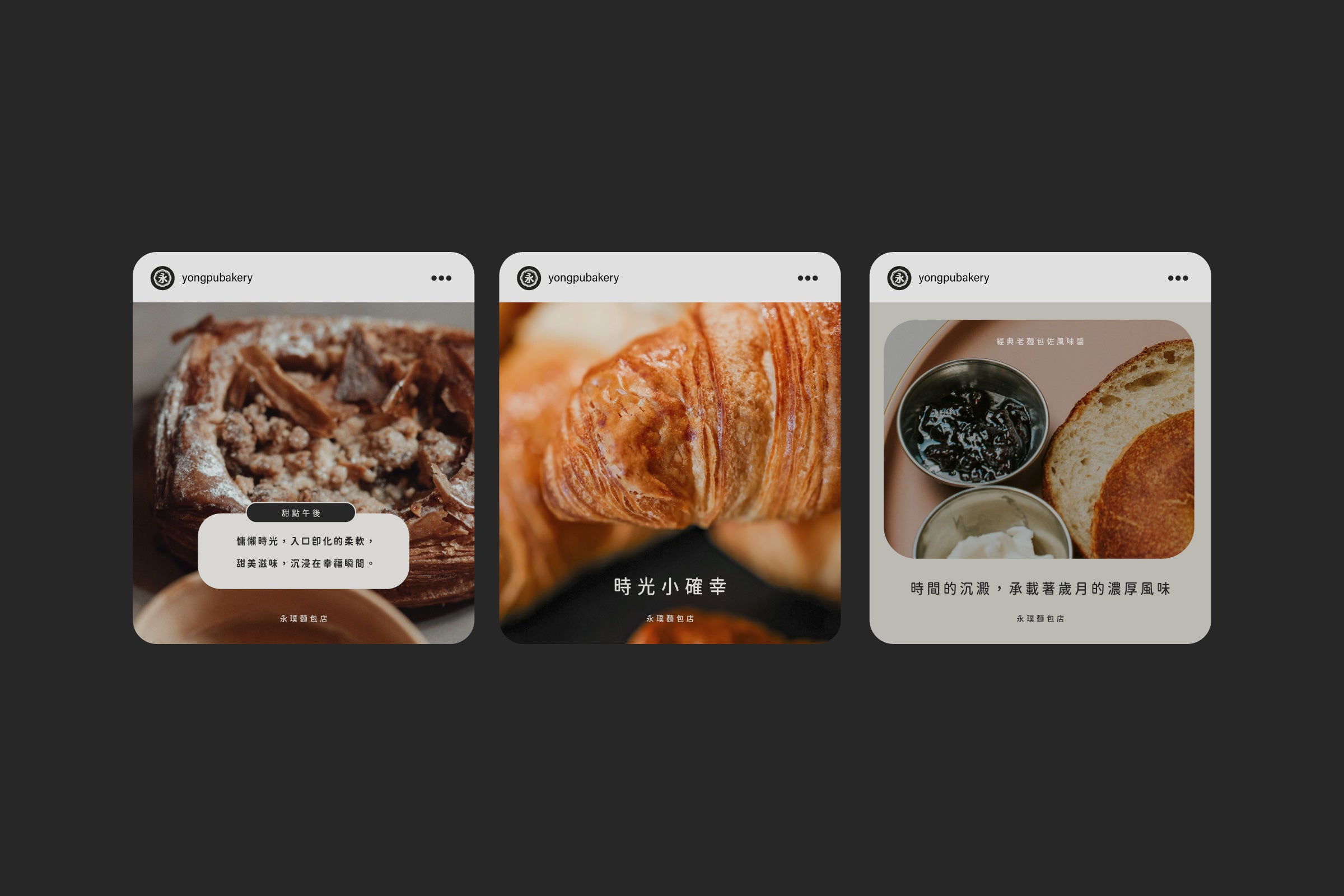
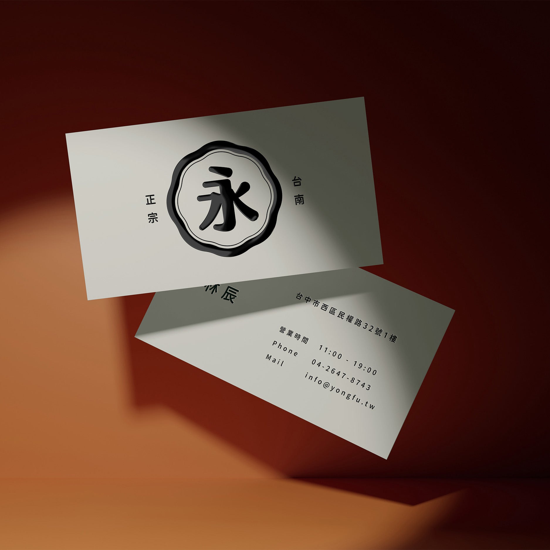
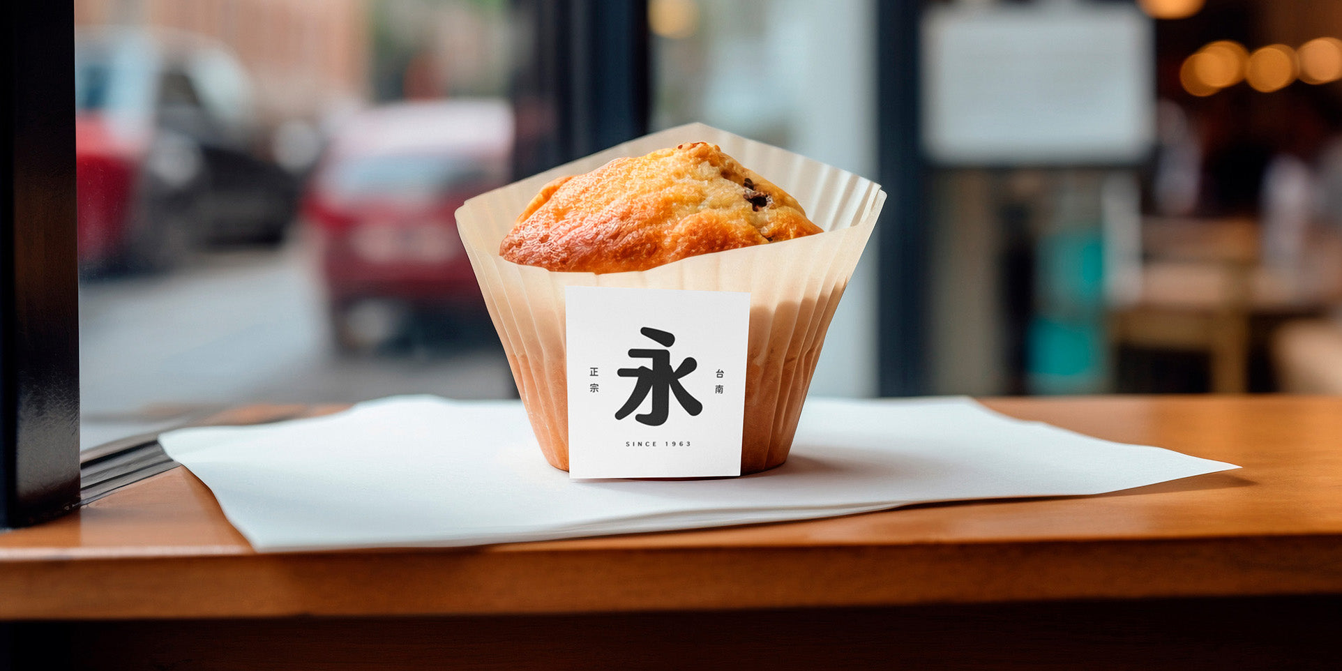
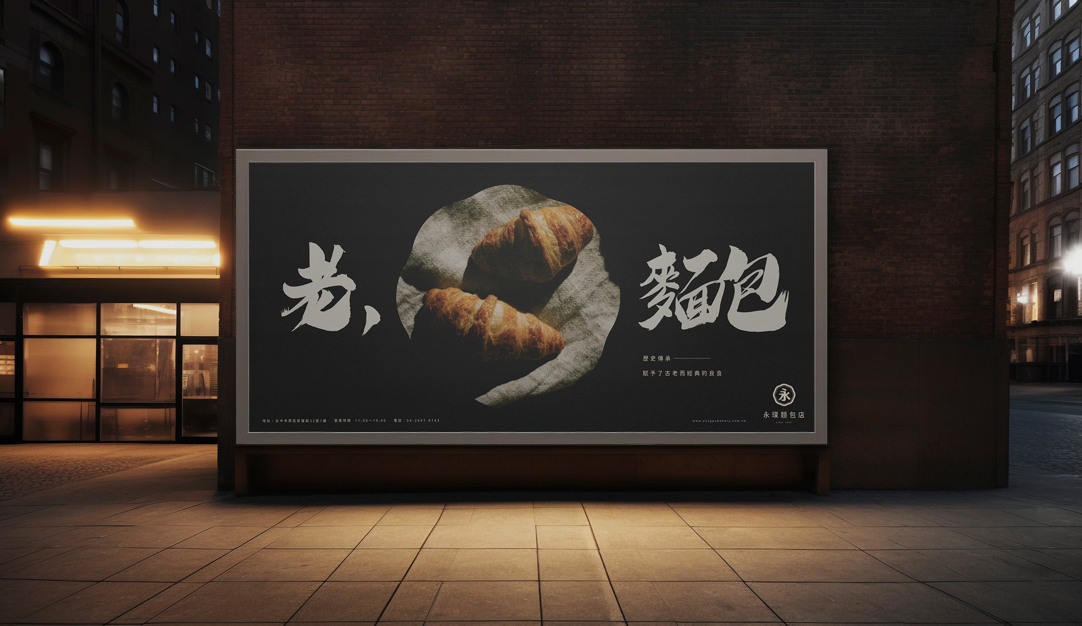
We will craft your brand story, making it visible to all. Our approach is to strategically and meticulously reshape the Yong Pu brand, ensuring that while we retain its traditional values, we also elevate its identity beyond its original scope. Through thoughtful communication, we developed the optimal brand identity strategy, ensuring that every aspect reflects the cultural essence of the “Yong” character. This refresh is not only a new look but a continuation of tradition, allowing existing customers to continue to feel the familiar quality while resonating with new audiences
我們將為您構築一個全新的品牌故事,使消費者能夠清楚地感受到永璞的文化精髓。我們以策略性的方式仔細重塑永璞的品牌形象,在保留其傳統價值的同時,使其更具現代感。透過深度的溝通,我們確立了最佳的品牌識別策略,讓永璞在每一個細節中都能展現出其「永」字的文化內涵。這不僅是一個嶄新的形象,也是對傳統文化的延續,讓老顧客繼續感受到熟悉的品質,並吸引新顧客的共鳴。
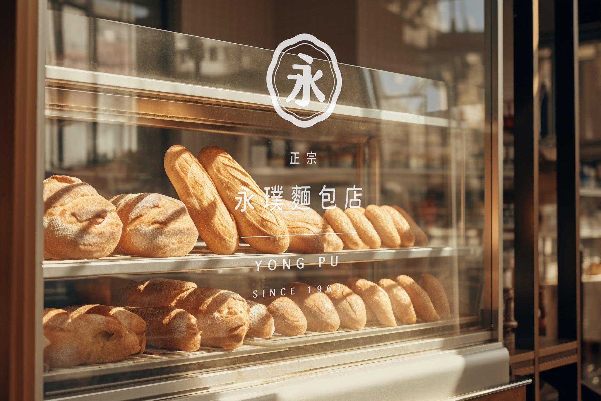
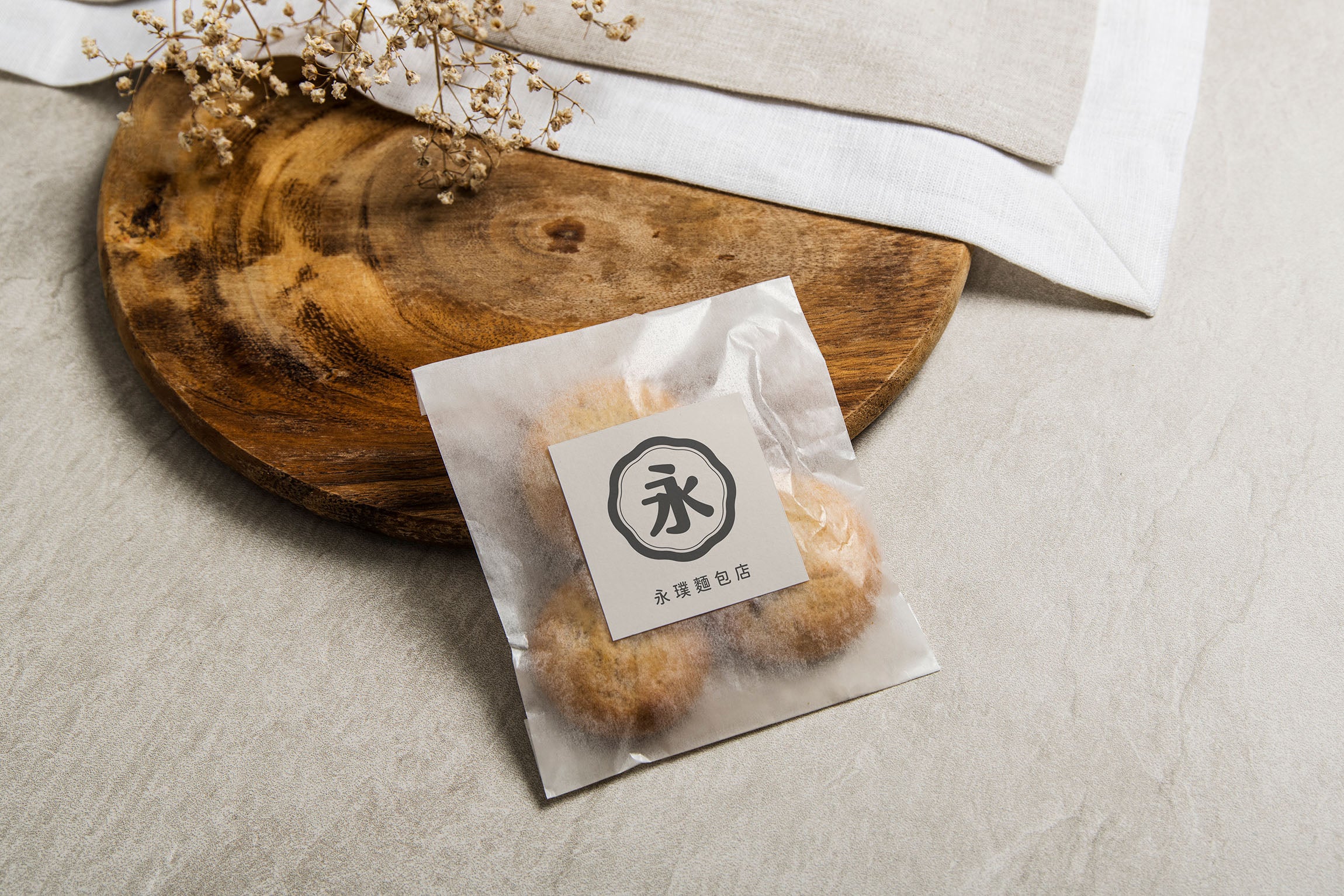
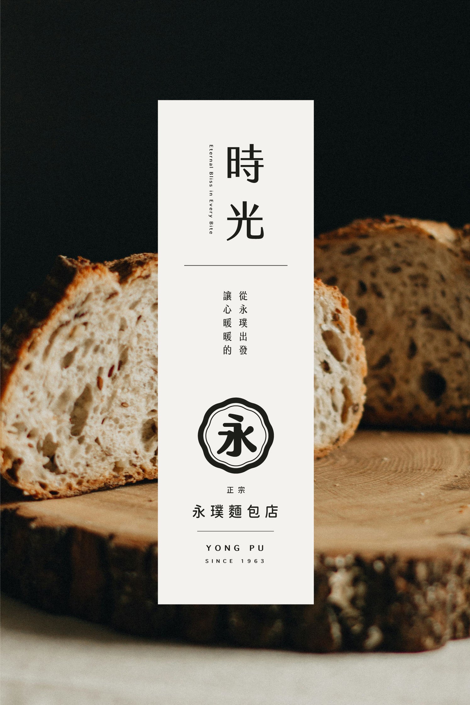
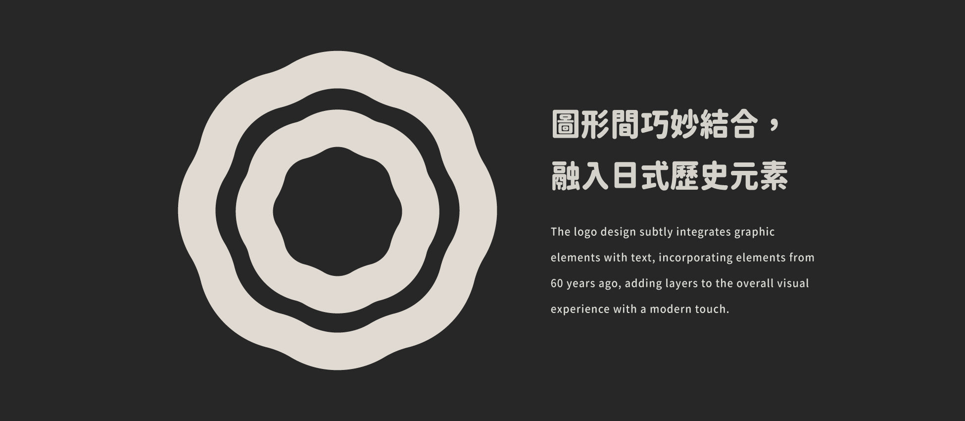
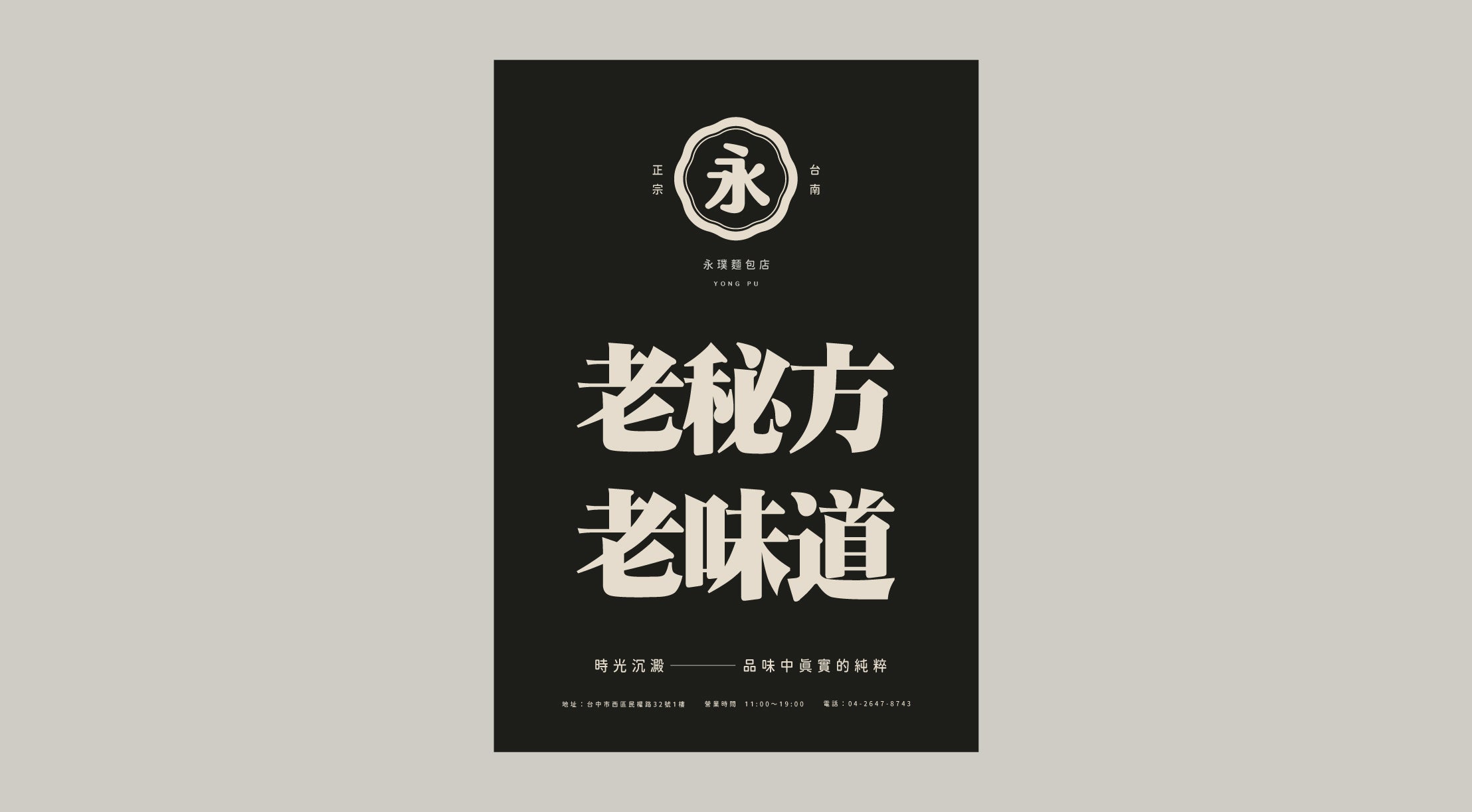
We incorporated traditional color palettes and blended them with black and white elements, creating a visually appealing cultural ambiance. The use of rounded typefaces not only breaks away from traditional serif fonts but also emphasizes the deliciousness of the bread, visually enticing the consumer. The logo design subtly integrates graphic elements with text, incorporating elements from 60 years ago, adding layers to the overall visual experience with a modern touch.
我們在設計中使用了大量傳統色調,並巧妙融合黑白元素,營造出一種濃郁的文化氛圍。圓體字型不僅顛覆了傳統襯線字體,還強調了麵包的美味,讓消費者在視覺上產生食慾。Logo 設計則將字形與圖形巧妙結合,融入了60年前的日式元素,為整體視覺增添層次感。
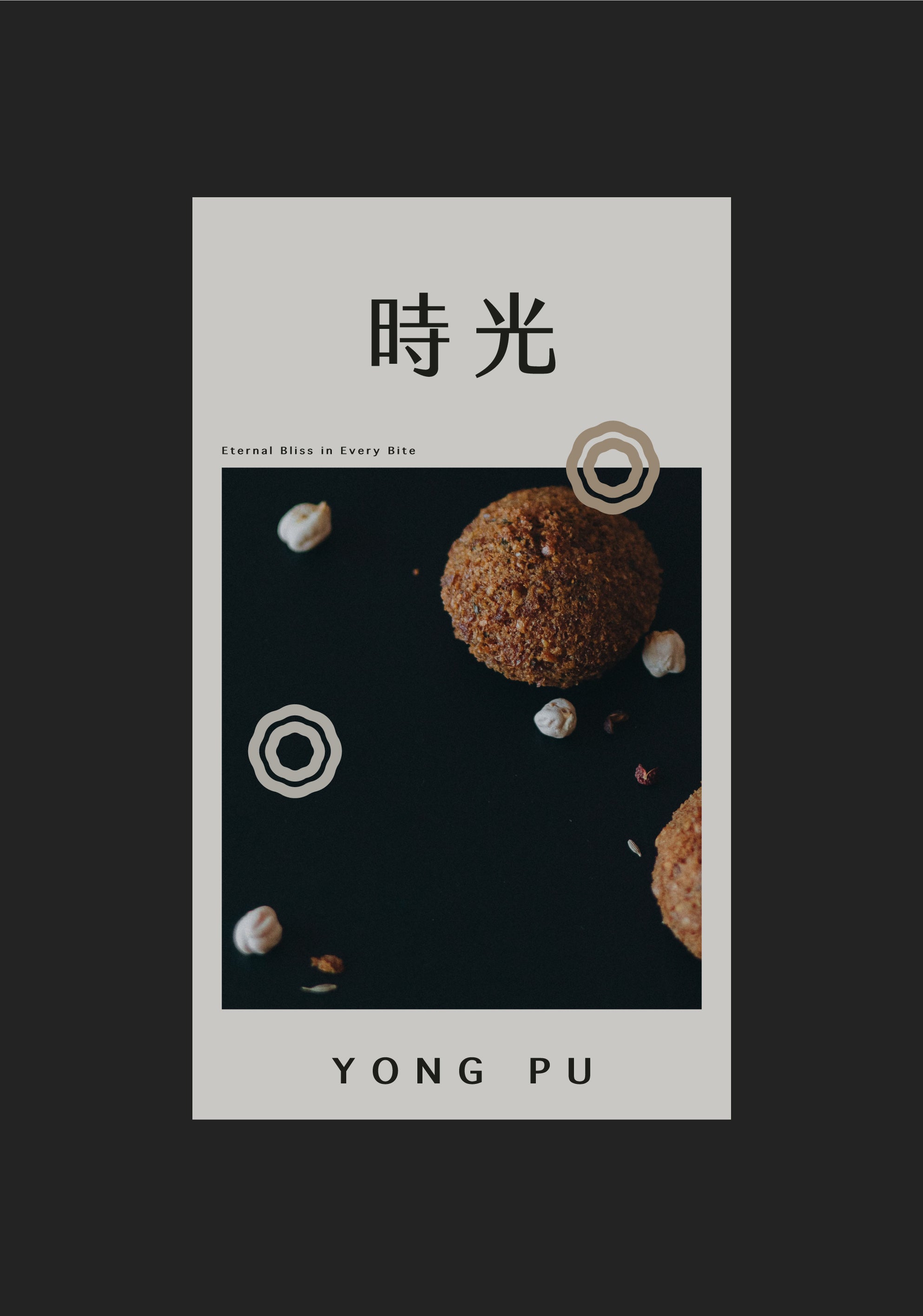
We selected a range of earthy tones and soft natural colors that align with the essence of bread. The primary typeface is rounded, complemented by a slightly serifed headline font. Olive and latte, often overlooked low-saturation colors, have been strategically retained for specific contexts. The addition of Sand and Tumbleweed tones enhances the aromatic feel of social media and packaging applications.
我們採用了大地色系和柔和的自然色調,這些色調與麵包的味道相呼應。主字體採用圓體,並搭配略帶襯線的標題字體來展現品牌形象。olive 與 latte 這兩種低彩度色彩被策略性地保留,以在特定情境中使用。Sand 與 Tumbleweed 色調則為社交媒體和包裝應用增添了濃郁的香氣感。
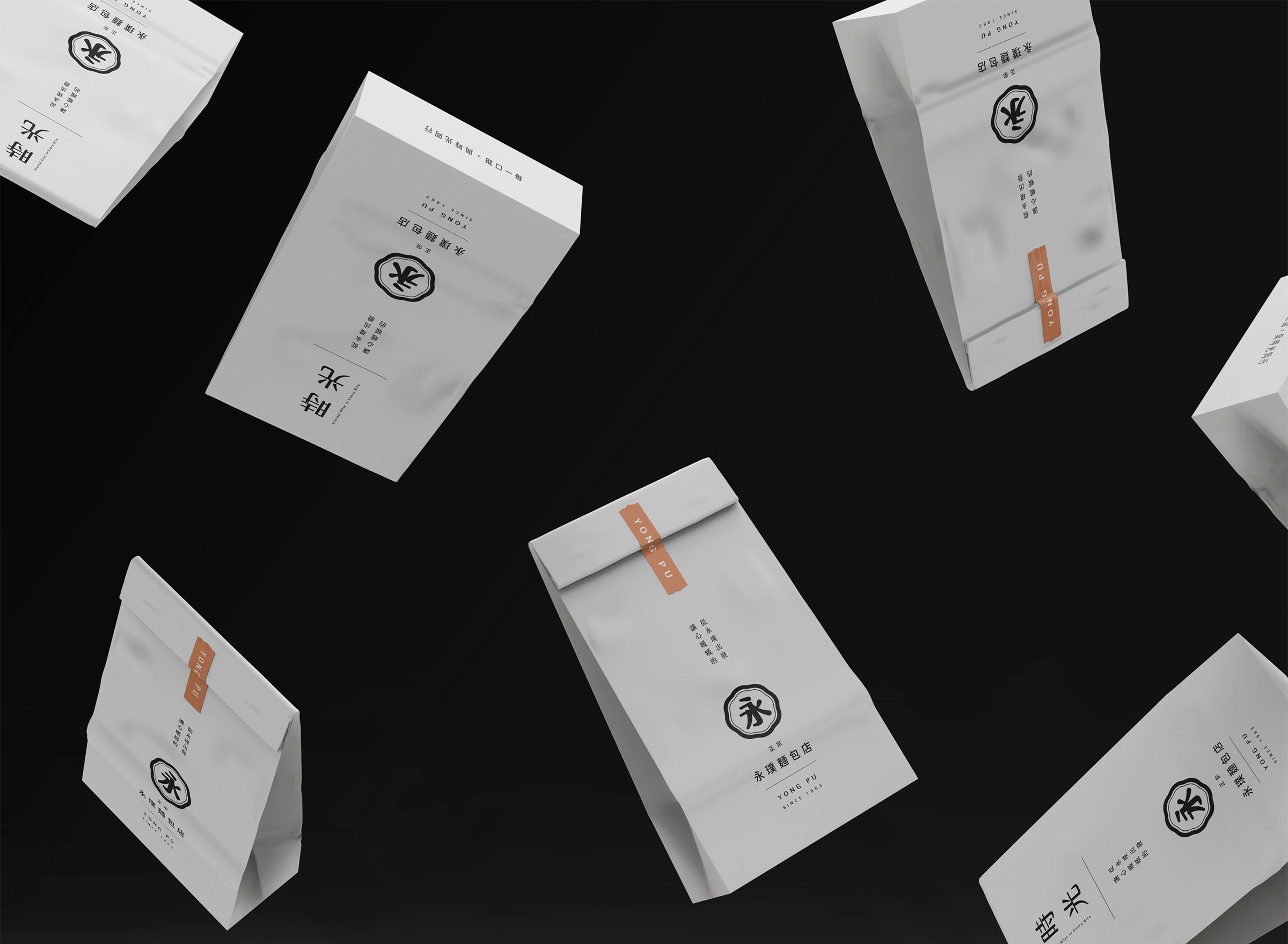
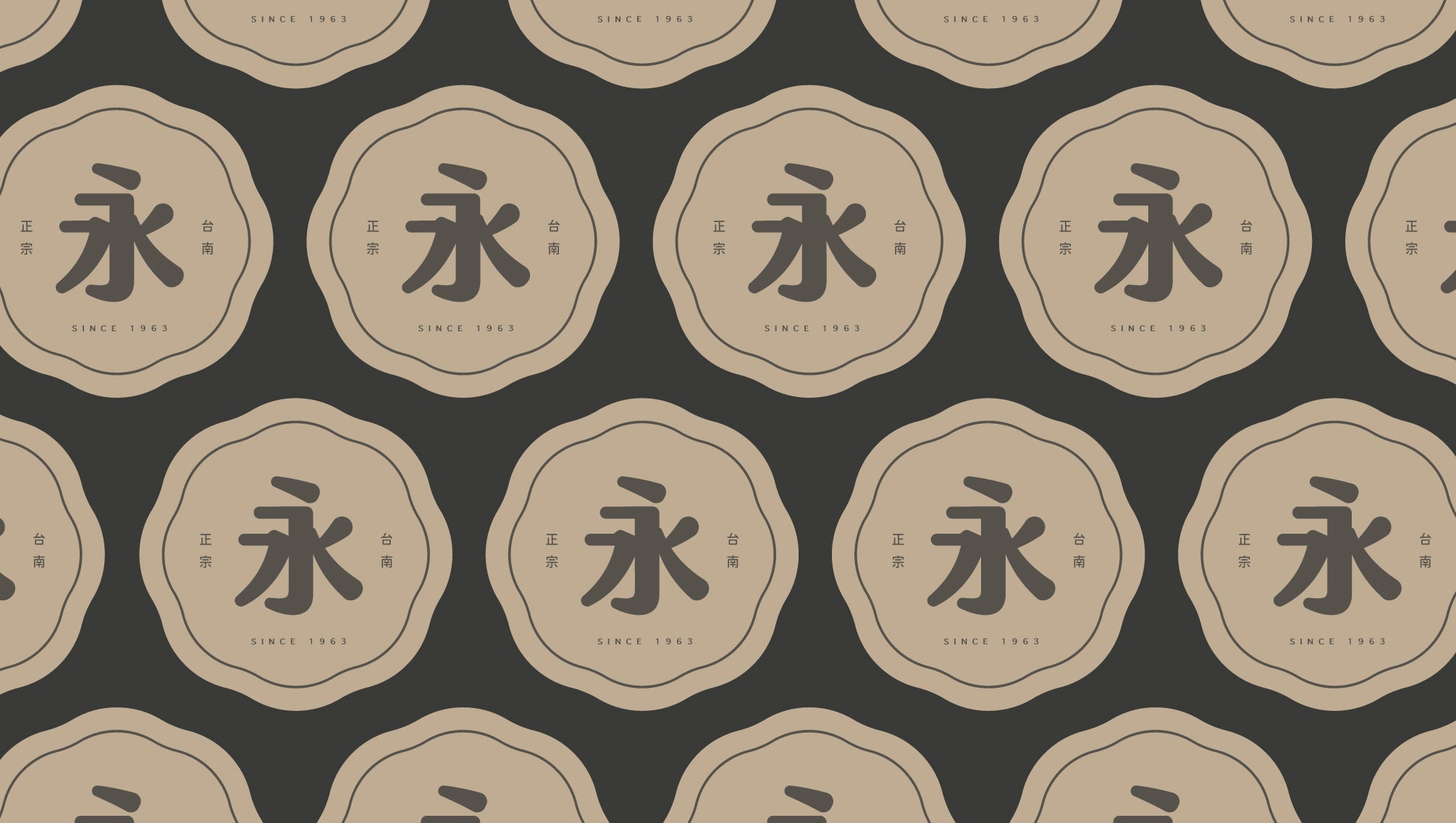
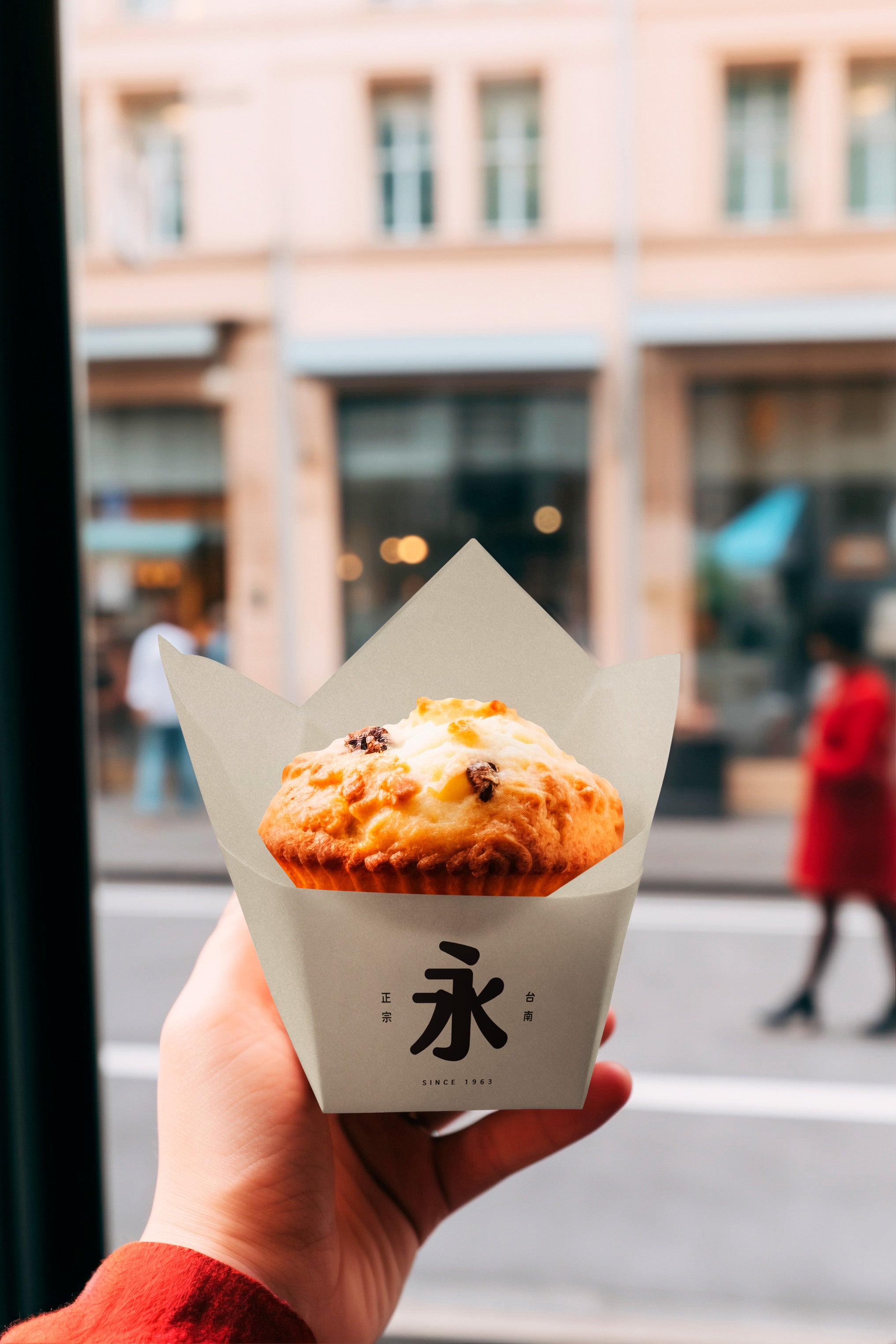
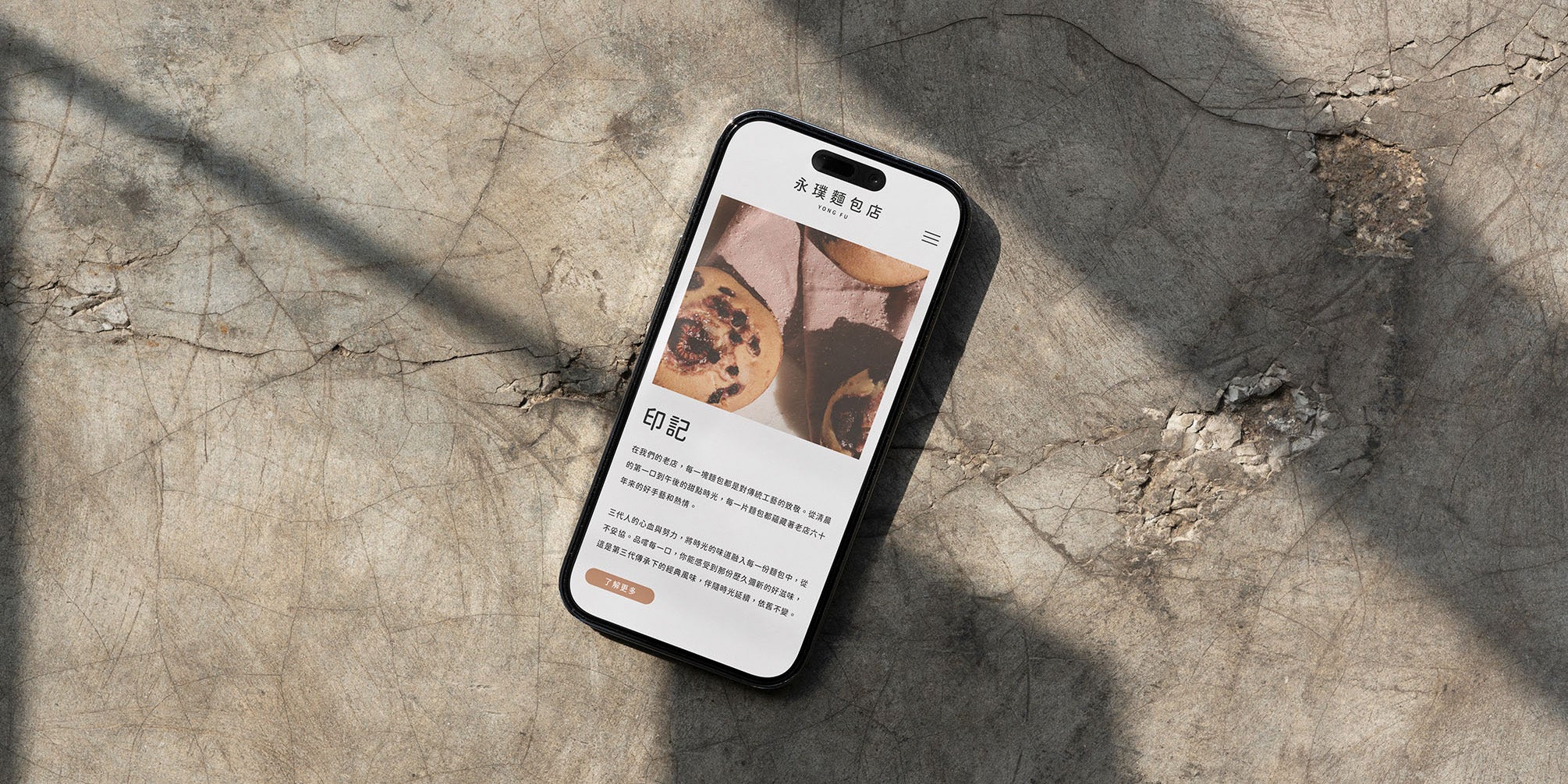
Finally, we created a website that captures the deep traditional cultural atmosphere while maintaining a modern aesthetic, aiming to convey the layered flavors found in Yong Pu’s bread.The simple storytelling and seamless presentation are designed to evoke the imagination of baking, inspiring customers to not only understand Yong Pu’s cultural value but also to envision the taste of the bread.
最終,我們設計了一個既保留傳統文化氣息又不失現代感的網站,旨在傳達永璞麵包的多層次風味。簡潔的故事敘述與流暢的展示,讓消費者在理解永璞文化價值的同時,也能想像自己品嚐麵包的美好感受。
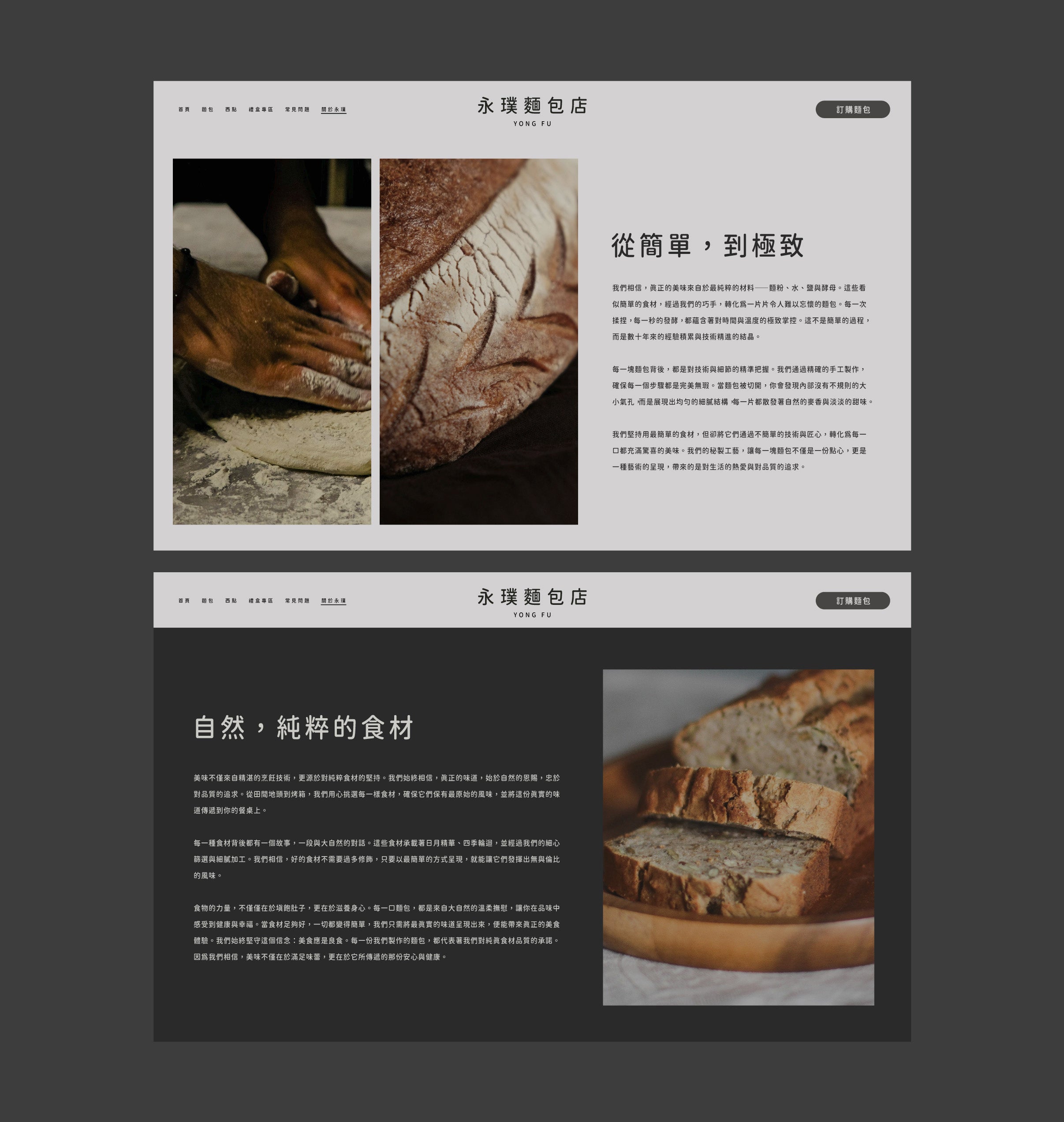

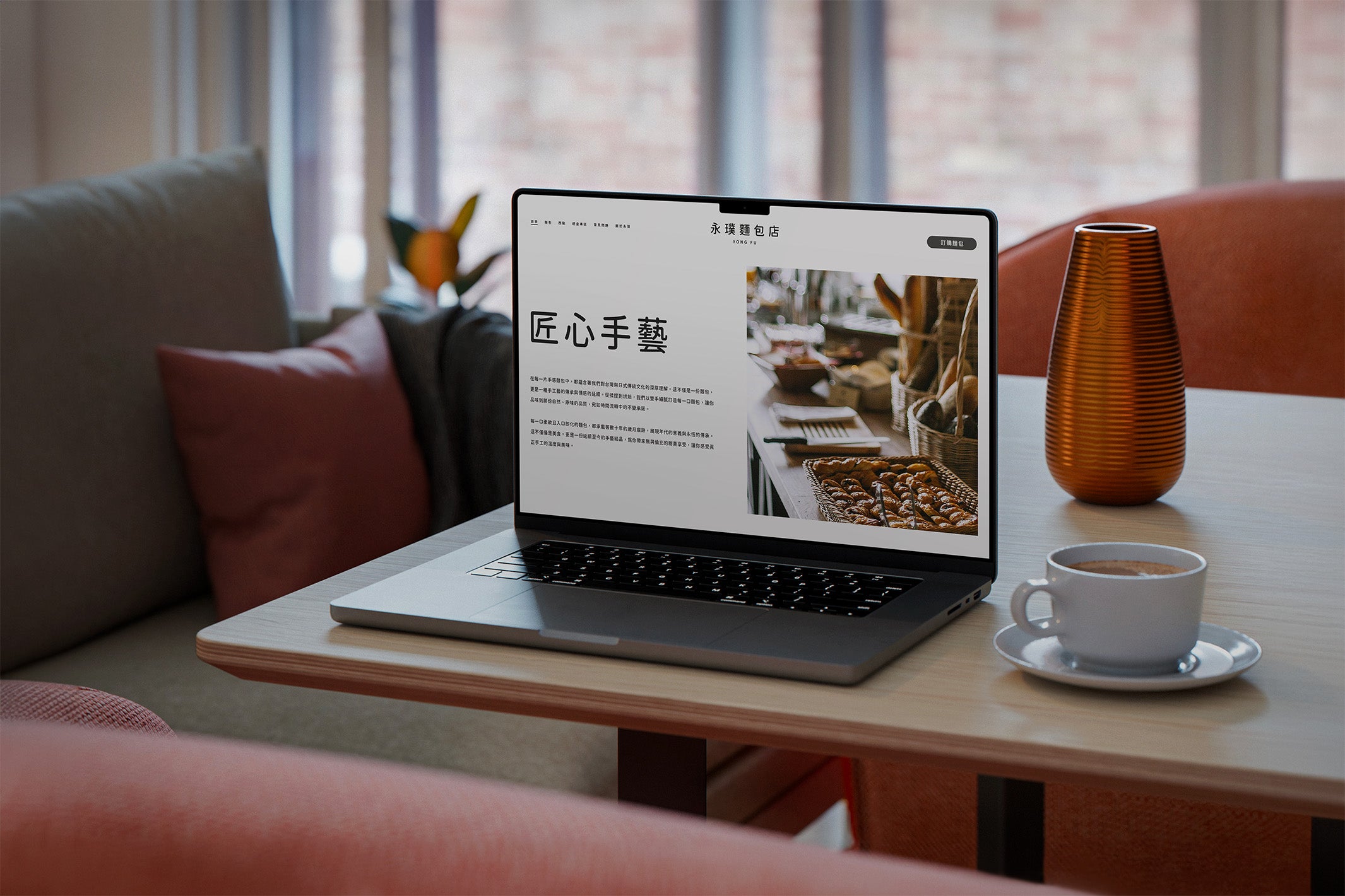
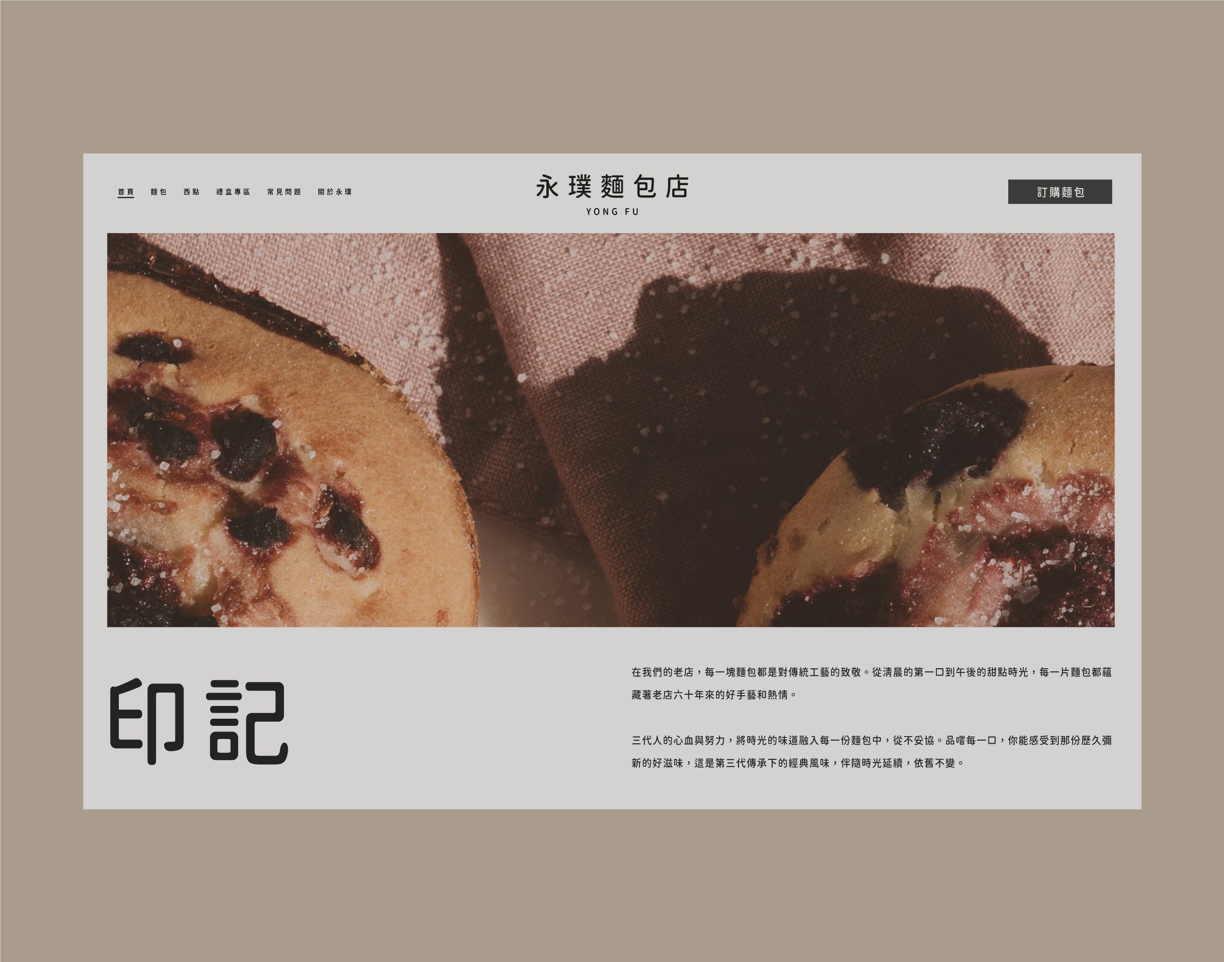
This brand image is a blend of Taiwanese and Japanese traditional culture, rich in historical significance yet modern in execution. The main logo features rounded, natural elements, carefully placed within an unconfined framework, reflecting the fusion of tradition and modernity.The typeface design incorporates a hand-written feel, while maintaining clean and organized lettering, symbolizing the timelessness of this long-established brand. The arrangement of the text brings out a refined modernity, with the overall concept focusing on a beautiful traditional typeface, paired with precisely arranged line frames, creating a distinctive brand visual identity.
這個品牌形象融合了台灣與日式傳統文化,既具有年代意義,又能與現代接軌。Logo 設計中包含圓潤自然的元素,並巧妙地置於不拘謹的框架內,象徵永恆不變的品牌價值。字體設計帶有手寫風格,但保留了整齊與乾淨的特質,字與字之間的排列賦予了現代感的精緻流暢。整體概念以精美的傳統字體為核心,搭配精密排列的線框,形成品牌獨特的視覺形象。
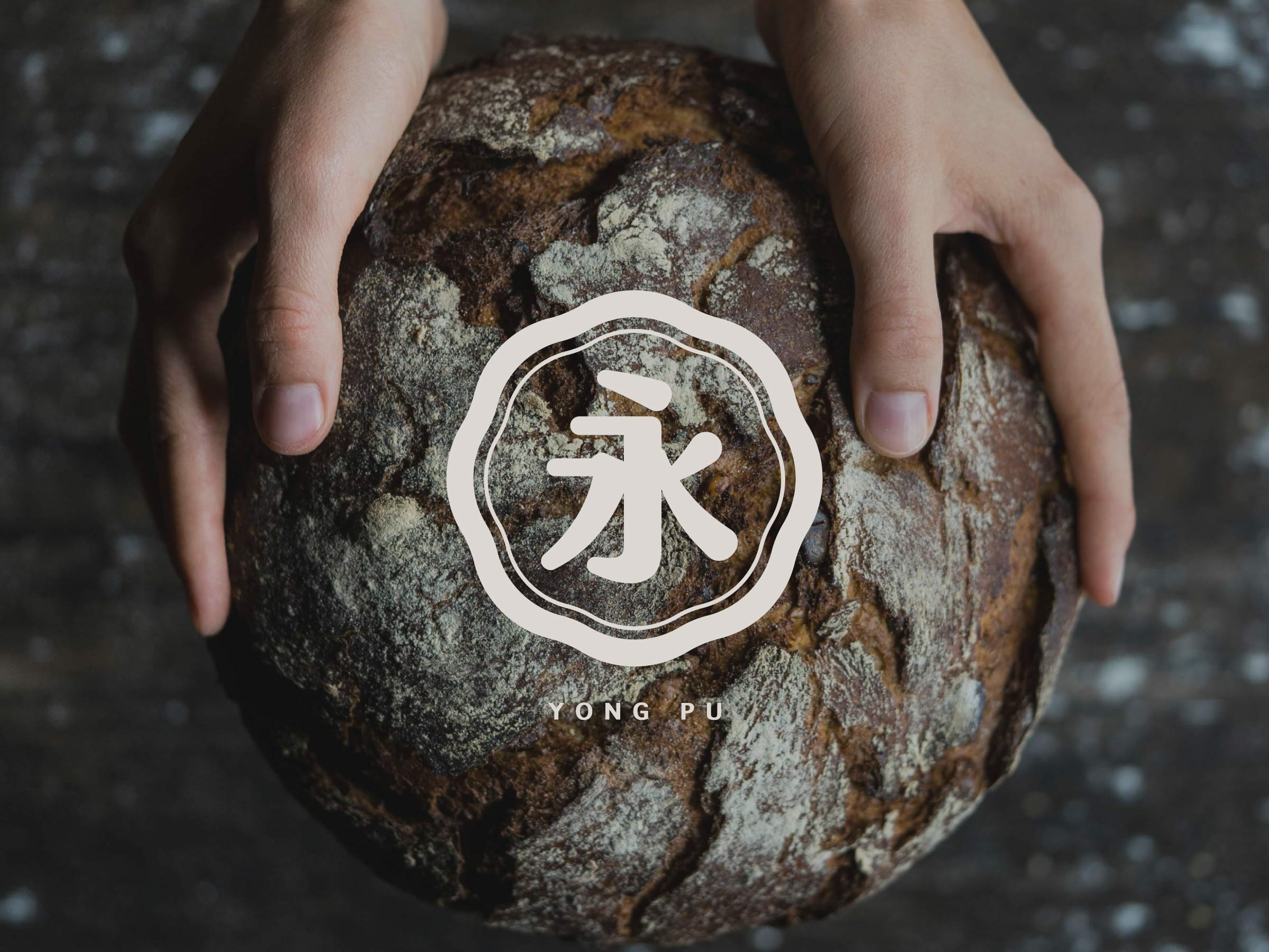

Join us on a brand adventure: strategy, positioning, visuals, and graphics. We're your partners in shaping a cohesive brand narrative.
美,浮現;由木而生

浮木藝術創作工作室
DESIGNING -
NOT JUST WORKING
To speak to us about a new project, please email fuumustudio@gmail.com
